
Time series are everywhere! In user behavior on a website, or stock prices of a Fortune 500 company, or any other time-related example. Time series data is evident in every industry in some shape or form.
Naturally, it’s also one of the most researched types of data. As a rule of thumb, you could say time series is a type of data that’s sampled based on some kind of time-related dimension like years, months, or seconds.
Time series are observations that have been recorded in an orderly fashion and which are correlated in time.
While analyzing time series data, we have to make sure of the outliers, much as we do in static data. If you’ve worked with data in any capacity, you know how much pain outliers cause for an analyst. These outliers are called “anomalies” in time series jargon.
Read also
Time Series Prediction: How Is It Different From Other Machine Learning?
What are anomalies/outliers and types of anomalies in time-series data?
From a traditional point of view, an outlier/anomaly is:
“An observation which deviates so much from other observations as to arouse suspicions that it was generated by a different mechanism.”
Therefore, you can think of outliers as observations that don’t follow the expected behavior.

As the figure above shows, outliers in time series can have two different meanings. The semantic distinction between them is mainly based on your interest as the analyst, or the particular scenario.
These observations have been related to noise, erroneous or unwanted data, which by itself isn’t interesting to the analyst. In these cases, outliers should be deleted or corrected to improve data quality, and generate a cleaner dataset that can be used by other data mining algorithms. For example, sensor transmission errors are eliminated to obtain more accurate predictions, because the main goal is to make predictions.
Nevertheless, in recent years – especially in the area of time series data – many researchers have aimed to detect and analyze unusual, but interesting phenomena. Fraud detection is a good example – the main objective is to detect and analyze the outlier itself. These observations are often referred to as anomalies.
The anomaly detection problem for time series is usually formulated as identifying outlier data points relative to some norm or usual signal. Take a look at some outlier types:

Let’s break this down one by one:
Point outlier
A point outlier is a datum that behaves unusually in a specific time instance when compared either to the other values in the time series (global outlier), or to its neighboring points (local outlier).
Example: are you aware of the Gamestop frenzy? A slew of young retail investors bought GME stock to get back at big hedge funds, driving the stock price way up. That sudden, short-lived spike that occurred due to an unlikely event is an additive (point) outlier. The unexpected growth of a time-based value in a short period (looks like a sudden spike) comes under additive outliers.

Point outliers can be univariate or multivariate, depending on whether they affect one or more time-dependent variables, respectively.
Fig. 1a contains two univariate point outliers, O1 and O2, whereas the multivariate time series is composed of three variables in Fig. 3b, and has both univariate (O3) and multivariate (O1 and O2) point outliers.

Fig: 1 — Point outliers in time series data. | Source
We will take a deeper look at Univariate Point Outliers in the Anomaly Detection section.
Subsequence outlier
This means consecutive points in time whose joint behavior is unusual, although each observation individually is not necessarily a point outlier. Subsequence outliers can also be global or local, and can affect one (univariate subsequence outlier) or more (multivariate subsequence outlier) time-dependent variables.
Fig. 2 provides an example of univariate (O1 and O2 in Fig. 2a, and O3 in Fig. 2b) and multivariate (O1 and O2 in Fig. 2b) subsequence outliers. Note that the latter does not necessarily affect all the variables (e.g., O2 in Fig. 2b).

Anomaly detection techniques in time series data
There are few techniques that analysts can employ to identify different anomalies in data. It starts with a basic statistical decomposition and can work up to autoencoders. Let’s start with the basic one, and understand how and why it’s useful.
Note
Here you can find the notebook and the data used in the article
STL decomposition
STL stands for seasonal-trend decomposition procedure based on LOESS. This technique gives you the ability to split your time series signal into three parts: seasonal, trend, and residue.
It works for seasonal time-series, which is also the most popular type of time series data. To generate an STL-decomposition plot, we just use the ever-amazing statsmodels to do the heavy lifting for us.
plt.rc('figure',figsize=(12,8))
plt.rc('font',size=15)
result = seasonal_decompose(lim_catfish_sales,model='additive')
fig = result.plot()

If we analyze the deviation of residue and introduce some threshold for it, we’ll get an anomaly detection algorithm. To implement this, we only need the residue data from the decomposition.
plt.rc('figure',figsize=(12,6))
plt.rc('font',size=15)
fig, ax = plt.subplots()
x = result.resid.index
y = result.resid.values
ax.plot_date(x, y, color='black',linestyle='--')
ax.annotate('Anomaly', (mdates.date2num(x[35]), y[35]), xytext=(30, 20),
          textcoords='offset points', color='red',arrowprops=dict(facecolor='red',arrowstyle='fancy'))
fig.autofmt_xdate()
plt.show()

Pros
It’s simple, robust, it can handle a lot of different situations, and all anomalies can still be intuitively interpreted.
Cons
The biggest downside of this technique is rigid tweaking options. Apart from the threshold and maybe the confidence interval, there isn’t much you can do about it. For example, you’re tracking users on your website that was closed to the public and then was suddenly opened. In this case, you should track anomalies that occur before and after launch periods separately.
Classification and Regression Trees (CART)
We can utilize the power and robustness of Decision Trees to identify outliers/anomalies in time series data.
- First, you can use supervised learning to teach trees to classify anomaly and non-anomaly data points. In order to do that, we’d need to have labeled anomaly data points, which you won’t find often outside of toy datasets.
- Unsupervised is what you need! We can use the Isolation Forest algorithm to predict whether a certain point is an outlier or not, without the help of any labeled dataset. Let’s see how.
The main idea, which is different from other popular outlier detection methods, is that Isolation Forest explicitly identifies anomalies instead of profiling normal data points. Isolation Forest, like any tree ensemble method, is based on decision trees.
In other words, Isolation Forest detects anomalies purely based on the fact that anomalies are data points that are few and different. The anomalies isolation is implemented without employing any distance or density measure.
- When applying an IsolationForest model, we set contamination = outliers_fraction, that is telling the model what proportion of outliers are present in the data. This is a trial/error metric.
- Fit and predict (data) performs outlier detection on data, and returns 1 for normal, -1 for the anomaly.
- Finally, we visualize anomalies with the Time Series view.
Let’s do it step by step. First, visualize the time series data:
plt.rc('figure',figsize=(12,6))
plt.rc('font',size=15)
catfish_sales.plot()

Next, we need to set some parameters like the outlier fraction, and train our IsolationForest model. We can utilize the super useful scikit-learn to implement the Isolation Forest algorithm. You can find the complete notebook with code and other stuff here.
outliers_fraction = float(.01)
scaler = StandardScaler()
np_scaled = scaler.fit_transform(catfish_sales.values.reshape(-1, 1))
data = pd.DataFrame(np_scaled)
# train isolation forest
model =  IsolationForest(contamination=outliers_fraction)
model.fit(data)
Lastly, we need to visualize how the prediction was.
catfish_sales['anomaly'] = model.predict(data)
# visualization
fig, ax = plt.subplots(figsize=(10,6))
a = catfish_sales.loc[catfish_sales['anomaly'] == -1, ['Total']] #anomaly
ax.plot(catfish_sales.index, catfish_sales['Total'], color='black', label = 'Normal')
ax.scatter(a.index,a['Total'], color='red', label = 'Anomaly')
plt.legend()
plt.show();

As you can see, the algorithm did a pretty good job in identifying our planted anomalies, but it also labeled a few points at the start as “outlier”. This is due to two reasons:
- At the start, the algorithm is pretty naive to be able to comprehend what qualifies as an anomaly. The more data it gets, the more variance it’s able to see, and it adjusts itself.
- If you see many true negatives, that means your contamination parameter is too high Conversely, if you don’t see the red dots where they should be, the contamination parameter is set too low.
Pros
The biggest advantage of this technique is you can introduce as many random variables or features as you like to make more sophisticated models.
Cons
The weakness is that a growing number of features can start to impact your computational performance fairly quickly. In this case, you should select features carefully.
Detection using Forecasting
Anomaly detection using Forecasting is based on an approach that several points from the past generate a forecast of the next point with the addition of some random variable, which is usually white noise.
As you can imagine, forecasted points in the future will generate new points and so on. Its obvious effect on the forecast horizon – the signal gets smoother.
The difficult part of using this method is that you should select the number of differences, number of autoregressions, and forecast error coefficients.
Each time you work with a new signal, you should build a new forecasting model.
Another obstacle is that your signal should be stationary after differencing. In simple words, it means your signal shouldn’t be dependent on time, which is a significant constraint.
We can utilize different forecasting methods such as Moving Averages, Autoregressive approach, and ARIMA with its different variants. The procedure for detecting anomalies with ARIMA is:
- Predict the new point from past datums and find the difference in magnitude with those in the training data.
- Choose a threshold and identify anomalies based on that difference threshold. That’s it!
To test this technique, we’re gonna use a popular module in time series called fbprophet. This module specifically caters to stationarity and seasonality, and can be tuned with some hyper-parameters.

We’ll utilize the same data as we did above with the same anomalies. First, let’s import it and make it ready for the environment:
from fbprophet import Prophet
Now let’s define the forecasting function. An important thing to note here is that fbprophet will add some additional metrics as features, in order to help identify anomalies better. For example, the predicted time series variable (by the model), the upper and lower limit of the target time series variable, and the trend metric.
def fit_predict_model(dataframe, interval_width = 0.99, changepoint_range = 0.8):
   m = Prophet(daily_seasonality = False, yearly_seasonality = False, weekly_seasonality = False,
               seasonality_mode = 'additive',
               interval_width = interval_width,
               changepoint_range = changepoint_range)
   m = m.fit(dataframe)
   forecast = m.predict(dataframe)
   forecast['fact'] = dataframe['y'].reset_index(drop = True)
   return forecast

pred = fit_predict_model(t)
We now have to push the pred variable to another function, which will detect anomalies based on a threshold of lower and upper limit in the time series variable.
def detect_anomalies(forecast):
   forecasted = forecast[['ds','trend', 'yhat', 'yhat_lower', 'yhat_upper', 'fact']].copy()
forecasted['anomaly'] = 0
   forecasted.loc[forecasted['fact'] > forecasted['yhat_upper'], 'anomaly'] = 1
   forecasted.loc[forecasted['fact'] < forecasted['yhat_lower'], 'anomaly'] = -1
#anomaly importances
   forecasted['importance'] = 0
   forecasted.loc[forecasted['anomaly'] ==1, 'importance'] =
       (forecasted['fact'] - forecasted['yhat_upper'])/forecast['fact']
   forecasted.loc[forecasted['anomaly'] ==-1, 'importance'] =
       (forecasted['yhat_lower'] - forecasted['fact'])/forecast['fact']

   return forecasted
pred = detect_anomalies(pred)
At last, we just need to plot the above predictions and visualize the anomalies.

Pros
This algorithm nicely handles different seasonality parameters like monthly or yearly, and it has native support for all time series metrics.
If you look closely, this algorithm can handle edge cases well as compared to the Isolation Forest algorithm.
Cons
Since this technique is based on forecasting, it will struggle in limited data scenarios. The quality of prediction in limited data will be lower, and so will the accuracy of anomaly detection.
Clustering-based anomaly detection
So far, we’ve looked at the IsolationForest algorithm as our unsupervised way of anomaly detection. Now, we’ll look into another unsupervised technique: Clustering!
The approach is pretty straightforward. Data instances that fall outside of defined clusters could potentially be marked as anomalies. We’re gonna use k-means clustering, because why not!
For the sake of visualizations, we’ll use a different dataset that corresponds to a multivariable time series with one or more time-based variables. The dataset will be a subset of the one found here (columns/features are the same).
Dataset Description: Data contains information on shopping and purchase as well as information on price competitiveness.
Now in order to process k-means, first we need to know the number of clusters we’re gonna be dealing with. The Elbow Method works pretty efficiently for this.
The Elbow method is a graph of the number of clusters vs the variance explained/objective/score
To implement this, we’ll use scikit-learn’s implementation of K-means.
data = df[['price_usd', 'srch_booking_window', 'srch_saturday_night_bool']]
n_cluster = range(1, 20)
kmeans = [KMeans(n_clusters=i).fit(data) for i in n_cluster]
scores = [kmeans[i].score(data) for i in range(len(kmeans))]
fig, ax = plt.subplots(figsize=(10,6))
ax.plot(n_cluster, scores)
plt.xlabel('Number of Clusters')
plt.ylabel('Score')
plt.title('Elbow Curve')
plt.show();

From the above elbow curve, we see that the graph levels off after 10 clusters, implying that the addition of more clusters do not explain much more of the variance in our relevant variable; in this case price_usd.
We set n_clusters=10, and upon generating the k-means output, use the data to plot the 3D clusters.

Now we need to find out the number of components (features) to keep.
data = df[['price_usd', 'srch_booking_window', 'srch_saturday_night_bool']]
X = data.values
X_std = StandardScaler().fit_transform(X)
#Calculating Eigenvecors and eigenvalues of Covariance matrix
mean_vec = np.mean(X_std, axis=0)
cov_mat = np.cov(X_std.T)
eig_vals, eig_vecs = np.linalg.eig(cov_mat)
# Create a list of (eigenvalue, eigenvector) tuples
eig_pairs = [ (np.abs(eig_vals[i]),eig_vecs[:,i]) for i in range(len(eig_vals))]
eig_pairs.sort(key = lambda x: x[0], reverse= True)
# Calculation of Explained Variance from the eigenvalues
tot = sum(eig_vals)
var_exp = [(i/tot)*100 for i in sorted(eig_vals, reverse=True)] # Individual explained variance
cum_var_exp = np.cumsum(var_exp) # Cumulative explained variance
plt.figure(figsize=(10, 5))
plt.bar(range(len(var_exp)), var_exp, alpha=0.3, align='center', label='individual explained variance', color = 'y')
plt.step(range(len(cum_var_exp)), cum_var_exp, where='mid',label='cumulative explained variance')
plt.ylabel('Explained variance ratio')
plt.xlabel('Principal components')
plt.legend(loc='best')
plt.show();

We see that the first component explains almost 50% of the variance. The second component explains over 30%. However, notice that almost none of the components are really negligible. The first 2 components contain over 80% of the information. So, we will set n_components=2.
The underlying assumption in the clustering-based anomaly detection is that if we cluster the data, normal data will belong to clusters while anomalies will not belong to any clusters, or belong to small clusters.
We use the following steps to find and visualize anomalies:
- Calculate the distance between each point and its nearest centroid. The biggest distances are considered anomalies.
- We use outliers_fraction to provide information to the algorithm about the proportion of the outliers present in our data set, similarly to the IsolationForest algorithm. This is largely a hyperparameter that needs hit/trial or grid-search to be set right – as a starting figure, let’s estimate, outliers_fraction=0.1
- Calculate number_of_outliers using outliers_fraction.
- Set the threshold as the minimum distance of these outliers.
- The anomaly result of anomaly1 contains the above method Cluster (0:normal, 1:anomaly).
- Visualize anomalies with cluster view.
- Visualize anomalies with Time Series view.
# return Series of distance between each point and its distance with the closest centroid
def getDistanceByPoint(data, model):
   distance = pd.Series()
   for i in range(0,len(data)):
       Xa = np.array(data.loc[i])
       Xb = model.cluster_centers_[model.labels_[i]-1]
       distance.at[i]=np.linalg.norm(Xa-Xb)
   return distance
outliers_fraction = 0.1
# get the distance between each point and its nearest centroid. The biggest distances are considered as anomaly
distance = getDistanceByPoint(data, kmeans[9])
number_of_outliers = int(outliers_fraction*len(distance))
threshold = distance.nlargest(number_of_outliers).min()
# anomaly1 contain the anomaly result of the above method Cluster (0:normal, 1:anomaly)
df['anomaly1'] = (distance >= threshold).astype(int)
fig, ax = plt.subplots(figsize=(10,6))
colors = {0:'blue', 1:'red'}
ax.scatter(df['principal_feature1'], df['principal_feature2'], c=df["anomaly1"].apply(lambda x: colors[x]))
plt.xlabel('principal feature1')
plt.ylabel('principal feature2')
plt.show();

Now, in order to see the anomalies against real-world features, we process the dataframe we created in the previous step.
df = df.sort_values('date_time')
fig, ax = plt.subplots(figsize=(10,6))
a = df.loc[df['anomaly1'] == 1, ['date_time', 'price_usd']] #anomaly
ax.plot(pd.to_datetime(df['date_time']), df['price_usd'], color='k',label='Normal')
ax.scatter(pd.to_datetime(a['date_time']),a['price_usd'], color='red', label='Anomaly')
ax.xaxis_date()
plt.xlabel('Date Time')
plt.ylabel('price in USD')
plt.legend()
fig.autofmt_xdate()
plt.show()

This method is able to encapsulate peaks pretty well, with some misses of course. A part of the issue may be the outlier_fraction hasn’t played around with many values.
Pros
The biggest advantage of this technique is similar to other unsupervised techniques, which is that you can introduce as many random variables or features as you like to make more sophisticated models.
Cons
The weakness is that a growing number of features can start to impact your computational performance fairly quickly. In addition to this, there are more hyper-parameters to tune and get right, so there’s always a chance of high model variance in performance.
Autoencoders
Can’t talk about data techniques without Deep Learning! So, let’s discuss Anomaly detection using Autoencoders.
Read also
Autoencoders are an unsupervised technique that recreates the input data while extracting its features through different dimensions. So, in other words, if we use the Latent Representation of data from Autoencoders, it corresponds to dimensionality reduction.
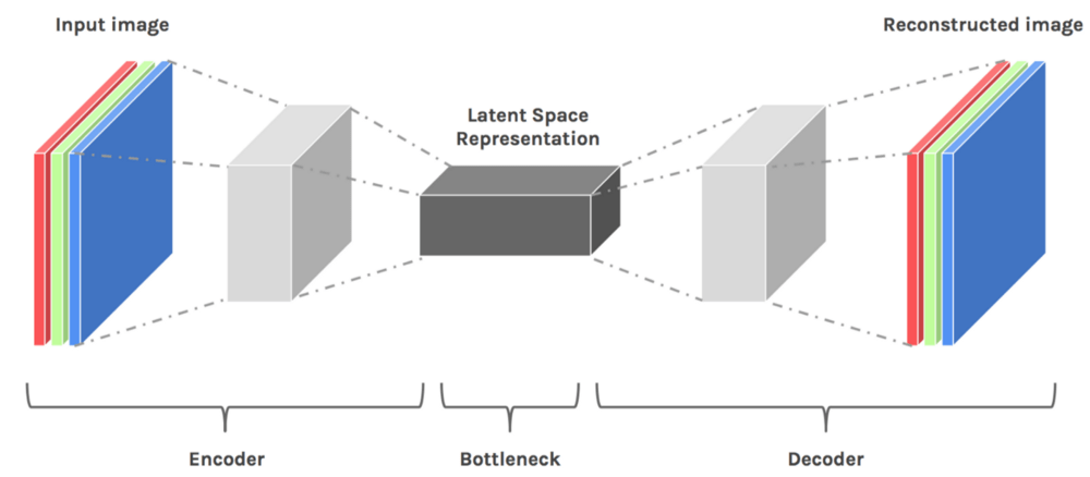
Why do we apply dimensionality reduction to find outliers?
Don’t we lose some information, including the outliers, if we reduce the dimensionality? The answer is that once the main patterns are identified, the outliers are revealed. Many distance-based techniques (e.g. KNNs) suffer the curse of dimensionality when they compute distances of every data point in the full feature space. High dimensionality has to be reduced.
Interestingly, during the process of dimensionality reduction outliers are identified. We can say outlier detection is a by-product of dimension reduction.
Autoencoders are an unsupervised approach to find anomalies.
Why autoencoders?
There are many useful tools, such as Principal Component Analysis (PCA), for detecting outliers. Why do we need autoencoders? The reason is that PCA uses linear algebra to transform. In contrast, autoencoder techniques can perform non-linear transformations with their non-linear activation function and multiple layers. It’s more efficient to train several layers with an autoencoder, rather than training one huge transformation with PCA. The autoencoder techniques thus show their merits when the data problems are complex and non-linear in nature.
Build the model
We can implement Autoencoders with popular frameworks like TensorFlow or Pytorch, but – for the sake of simplicity – we’re gonna use a python module called PyOD, which builds autoencoders internally using few inputs from the user.
For the data part, let’s use the utility function generate_data() of PyOD to generate 25 variables, 500 observations, and ten percent outliers.
import numpy as np
import pandas as pd
from pyod.models.auto_encoder import AutoEncoder
from pyod.utils.data import generate_data
contamination = 0.1  # percentage of outliers
n_train = 500  # number of training points
n_test = 500  # number of testing points
n_features = 25 # Number of features
X_train, y_train, X_test, y_test = generate_data(
   n_train=n_train, n_test=n_test,
   n_features= n_features,
   contamination=contamination,random_state=1234)
X_train = pd.DataFrame(X_train)
X_test = pd.DataFrame(X_test)
When you do unsupervised learning, it’s always a safe step to standardize the predictors like below:
from sklearn.preprocessing import StandardScaler
X_train = StandardScaler().fit_transform(X_train)
X_train = pd.DataFrame(X_train)
X_test = StandardScaler().fit_transform(X_test)
X_test = pd.DataFrame(X_test)
In order to get a good sense of what the data looks like, let’s use PCA to reduce it to two dimensions, and plot accordingly.
from sklearn.decomposition import PCA
pca = PCA(2)
x_pca = pca.fit_transform(X_train)
x_pca = pd.DataFrame(x_pca)
x_pca.columns=['PC1','PC2']
cdict = {0: 'red', 1: 'blue'}
# Plot
import matplotlib.pyplot as plt
plt.scatter(X_train[0], X_train[1], c=y_train, alpha=1)
plt.title('Scatter plot')
plt.xlabel('x')
plt.ylabel('y')
plt.show()

The black points clustered together are the typical observations, and the yellow points are the outliers.
Model specification
- [25, 2, 2, 25]. The input layer and the output layer have 25 neurons each. There are two hidden layers, each has two neurons.
Step 1 — Build your model
clf = AutoEncoder(hidden_neurons =[25, 2, 2, 25])
clf.fit(X_train)
Step 2 — Determine the cut point
Let’s apply the trained model Clf to predict the anomaly score for each observation in the test data. How do we define an outlier? An outlier is a point that’s distant from other points, so the outlier score is defined by distance. The PyOD function .decision_function() calculates the distance, or the anomaly score, for each data point.
# Get the outlier scores for the train data
y_train_scores = clf.decision_scores_
# Predict the anomaly scores
y_test_scores = clf.decision_function(X_test)  # outlier scores
y_test_scores = pd.Series(y_test_scores)
# Plot it!
import matplotlib.pyplot as plt
plt.hist(y_test_scores, bins='auto')
plt.title("Histogram for Model Clf1 Anomaly Scores")
plt.show()
If we use a histogram to count the frequency by the anomaly score, we will see the high scores corresponds to a low frequency — evidence of outliers. We choose 4.0 to be the cut point and those >=4.0 to be outliers.

Step 3 — Get the summary statistics by cluster
Let’s assign those observations with less than 4.0 anomaly scores to Cluster 0, and to Cluster 1 for those above 4.0. Also, let’s calculate the summary statistics by cluster using .groupby() . This model has identified 50 outliers (not shown).
df_test = X_test.copy()
df_test['score'] = y_test_scores
df_test['cluster'] = np.where(df_test['score']<4, 0, 1)
df_test['cluster'].value_counts()
df_test.groupby('cluster').mean()
The following output shows the mean variable values in each cluster. The values of Cluster ‘1’ (the abnormal cluster) are quite different from those of Cluster ‘0’ (the normal cluster). The “score” values show the average distance of those observations to others. A high “score” means that observation is far away from the norm.

This way, we can distinguish and label pretty perfectly between typical datums and anomalies.
Pros
- Autoencoders can handle high-dimensional data with ease.
- Pertaining to its nonlinearity behavior, it can find complex patterns within high-dimensional datasets.
Cons
- Since it’s a deep learning-based strategy, it will particularly struggle if the data is less.
- Computation costs will skyrocket if the depth of the network increases and while dealing with big data.
So far we’ve seen how to detect and identify anomalies. But the real question arises after finding them. Now what? What do we do about it?
Let’s discuss some of the pointers you could apply in your scenario.
How to deal with the anomalies?
After detection, there comes a big question of what to do about the stuff we identified. There are numerous ways to deal with the newly found information. I’ll list some of them based on my experience to give you a headway on how to approach this question.
Understanding the business case
Anomalies almost always provide new information and perspective to your problems. Stock prices going up suddenly? There has to be a reason for this like we saw with Gamestop, a pandemic could be another. So, understanding the reasons behind the spike can help you solve the problem in an efficient manner.
Understanding the business use case can also help you identify the problem better. For instance, you might be working on some sort of fraud detection which means your primary goal is indeed understanding the outliers in the data.
If none of this is your concern, you can move to remove or smoothen out the outlier.
Statistical methods to adjust outliers
Statistical methods let you adjust the value of your outlier to match the original distribution. Let’s see one of the methods that use mean to smoothen out the anomalies.
Using mean to smoothen out the outlier
The idea is to smoothen out the anomaly by using data from the previous DateTime. E.g., to even out a sudden usage of electricity due to an event that happened in your house, you could take an average of usages in the same month for previous years.
Let’s implement the same to get a clear picture. We’ll employ the same catfish sales data we did earlier. We can adjust with the mean using the script below.
adjusted_data = lim_catfish_sales.copy()
adjusted_data.loc[curr_anomaly] = december_data[(december_data.index != curr_anomaly) & (december_data.index < test_data.index[0])].mean()
Plotting the adjusted data and the old data will look something like this:
plt.figure(figsize=(10,4))
plt.plot(lim_catfish_sales, color='firebrick', alpha=0.4)
plt.plot(adjusted_data)
plt.title('Catfish Sales in 1000s of Pounds', fontsize=20)
plt.ylabel('Sales', fontsize=16)
for year in range(start_date.year,end_date.year):
   plt.axvline(pd.to_datetime(str(year)+'-01-01'), color='k', linestyle='--', alpha=0.2)
plt.axvline(curr_anomaly, color='k', alpha=0.7)

This way, you can proceed to apply forecasting or analysis without worrying much about skewness in your results.
There are numerous methods to deal with non-time series data but unfortunately cannot be used directly in Timeseries due to the difference in underlying structures. Non-time series methods of dealing involve a lot of distribution-based methods which can’t be simply translated to Timeseries data. If you wish to look at some of those, you can head over here.
Removing the Outlier
The last option if none of the above two sparks any debate in your solution is to get rid of the anomalies. This is not recommended (as you’re basically getting rid of some potentially valuable information) unless it’s absolutely necessary and it doesn’t harm the analysis in the future.
You can use the .drop() feature in pandas after identification. It will do the heavy lifting for you.
You’ve reached the end!
Congratulations! You now know about Anomalies, how to detect them, and what you can do about them. Few endnotes:
- Time series data varies a lot depending on the business case, so it’s better to experiment and find out what works instead of just applying what you find. Experience can do wonders!
- There are tons of techniques for anomaly detection apart from what we’ve discussed on this blog. I encourage you to read more in research papers.
You can find the complete notebook with code and some bonus stuff here!
That’s it for now, stay tuned for more! Adios!
Note: images are created by the author unless stated otherwise.
