
Machine learning has expanded rapidly in the last few years. Instead of simple, one-directional, or linear ML pipelines, today data scientists and AI/ML engineers run multiple parallel experiments that can get overwhelming even for large teams. Each experiment is expected to be recorded in an immutable and reproducible format, which results in endless logs with invaluable details.
We need to narrow down our techniques by thoroughly comparing machine learning models with parallel experiments. A well-planned approach is necessary to understand how to choose the right combination of algorithms and the data at hand.
So, in this article, we will explore how to approach comparing ML models and algorithms.
Comparing ML models is part of the broader process of tracking ML experiments.
Other than that, experiment tracking is about storing all the important data and metadata, debugging model training, and, generally, analyzing the results of experiments.
—
On the Neptune blog, you can find a separate piece on what experiment tracking is, written by Jakub Czakon, one of the co-founders of neptune.ai (which is actually an experiment tracking tool and the company behind this blog).
—
There’s also an article about the 13 best experiment tracking tools, including an extensive table comparing the features of all 13 tools.
The challenge of model selection
Each model or machine learning algorithm has several features that process the data in different ways. Often the data that is fed to these algorithms is also different depending on previous experimental stages. However, since machine learning teams and developers usually record their experiments, there’s ample data available for comparison.
The challenge is to understand which parameters, data, and metadata must be considered to arrive at the final choice. It’s the classic paradox of having an overwhelming amount of details with no clarity.
An even greater challenge is determining whether a higher metric score actually means that the model is better than one with a lower score or if the difference is only caused by statistical bias or a flawed metric design.
The Ultimate Guide to Evaluation and Selection of Models in Machine Learning
Comparing machine learning algorithms: why we do it?
Comparing machine learning algorithms is valuable on its own, but there are some not-so-obvious benefits of effectively comparing various experiments. Let’s take a look at the goals of comparison:
- Better performance: the primary objective of model comparison and selection is to improve the performance of the machine learning software/solution. The objective is to narrow down the best algorithms that suit the data and the business requirements.
- Longer lifetime: high performance can be short-lived if the chosen model is overly dependent on the training data and fails to generalize to unseen data. So, it’s also important to select a model that captures the underlying data patterns so that the predictions remain accurate over time with minimal need for re-training.
- Easier re-training: when we evaluate models and prepare them for comparison, we also record documentation (the best parameters, configurations, results, etc.). These details ease retraining the model if there is a failure, because we don’t need to redo the previous analysis. As a result, we can retrace the decisions made during initial model selection and find the potential causes for the failure (making it easier to adjust the model based on past experiences). As a result, retraining can begin immediately and proceed with greater efficiency.
- Speedy production: with the model details available at hand, it’s easy to narrow down on models that can offer high processing speed and that use memory resources optimally. Also during production, configuring machine learning solutions requires setting key parameters, such as memory usage, processing speed, and response time, to ensure optimal performance and resource efficiency.. Having production-level data can be useful for easily aligning with the production engineers. Moreover, knowing the resource demands of different algorithms, it will also be easier to check their compliance and feasibility concerning the organization’s allocated assets.
You may find interesting
They summarized the goals of efficient comparison methods and what benefits they bring:
 Neptune made it much easier to compare the models and select the best one over the last couple of months, especially since we’ve been working on this player and team separation model in an unsupervised way, during a match, to split the players into two separate teams.
Łukasz Grad, Chief Data Scientist at ReSpo.Vision
If we can choose the best performing model, then we can save time because we would need fewer integrations to ensure high data quality. Customers are much happier because they receive higher quality data, enabling them to perform more detailed match analytics.
(…) If we know which models will be the best and how to choose the best parameters for them to run many pipelines, then we will just run fewer pipelines. This, in turn, will cause the compute time to be shorter, and then we save money by not running unnecessary pipelines that will deliver suboptimal results.Wojtek Rosiński, Chief Technology Officer at ReSpo.Vision
Parameters of machine learning algorithms and how to compare them
Let’s dive right into analyzing and understanding how to compare the different characteristics of algorithms that can be used to sort and choose the best machine learning models. I divided the comparable parameters into two high-level categories:
- development-based,
- and production-based parameters.
Development-based parameters
Statistical tests
On a fundamental level, machine learning models are statistical equations that run at great speed on multiple data points to arrive at a conclusion. Therefore, conducting statistical tests on the algorithms is critical to set them right and also to understand if the model’s equation is the right fit for the dataset at hand. Here’s a handful of popular statistical tests that can be used to set the grounds for comparison:
- Null hypothesis testing: null hypothesis testing is used to determine if the differences in two data samples or metric performances are statistically significant—meaning they reflect a true effect rather than random noise or coincidence.
- ANOVA (Analysis Of Variance): ANOVA is a statistical method used to determine whether there are significant differences between the means of three or more groups. For example, ANOVA can help reveal if different teaching methods result in different student scores or if all methods have similar effects. It uses one or more categorical independent variables (e.g., teaching method) to analyze their impact on a continuous dependent variable (e.g., student scores). Unlike Linear Discriminant Analysis (LDA), which is a classification technique, ANOVA focuses on comparing the means of the groups to assess variation.
- Chi-Square: it’s a statistical tool or test that assesses the likelihood of association or correlation between categorical variables by comparing the observed and expected frequencies in each category.
- Student’s t-test: it compares the means of two samples from normal distributions when the standard deviation is unknown to determine if the differences are statistically significant.
- Ten-fold cross-validation: the 10-fold cross-validation compares the performance of each algorithm on different datasets that have been configured with the same random seed to maintain uniformity in testing. Next, a hypothesis test like the student’s paired t-test should be deployed to validate if the differences in metrics between the two models are statistically significant.
Model features and objectives
To choose the best machine learning model for a given dataset, it’s essential to consider the features or parameters of the model. The parameters and model objectives help to gauge the model’s flexibility, assumptions, and learning style.
When comparing linear regression models, we can choose between different ways to measure their errors. Some models try to minimize Mean Squared Error (MSE), while others aim to reduce Mean Absolute Error (MAE). The choice really comes down to how we want to handle outliers in our data.
If we have outliers in our dataset and want to consider them without letting them skew our results, using MAE makes more sense. The reason is pretty straightforward: MAE just takes the absolute value of errors, so it treats all deviations more evenly. MSE, on the other hand, squares the errors, which makes extreme values have a much bigger impact on the final model. So when we want outliers to matter but not take over, an MAE-based model tends to work better.
Similarly for classification, if two models (for example, decision tree and random forest) are considered, then the primary basis for comparison will be the degree of generalization that the model can achieve. A decision tree model with just one tree will have a limited ability to reduce variance through the max_depth parameter, whereas a random forest model will have an extended ability to bring generalization via both max_depth and n_estimators parameters.
Several other behavioural features of the model can be taken into account, like the type of assumptions made by the model, parametricity, speed, learning styles (tree-based vs non-tree-based), and more.
You can use parallel coordinates to see how different model parameters affect the metrics. Here’s what it looks like in Neptune:


Disclaimer
Please note that this article references a deprecated version of Neptune.
For information on the latest version with improved features and functionality, please visit our website.
Learning curves
Learning curves can help in determining if a model is on the correct learning trajectory of achieving the bias-variance tradeoff. It also provides a basis for comparing different machine learning models – a model with stable learning curves across both training and validation sets is likely going to perform well over a longer period on unseen data.
Bias is the assumption used by machine learning models to make the learning process easier. Variance is the measure of how much the estimated target variable will change with a change in training data. In other words, it measures the sensitivity of the model to variations in the training set. The ultimate goal is to reduce both bias and variance to a minimum – a state of high stability with few assumptions.
Bias and variance are indirectly proportional to each other, and the only way to reach a minimum point for both is at the intersection point. One way to understand if a model has achieved a significant level of trade-off is to see if its performance across training and testing datasets is nearly similar.

The best way to track the progress of model training is to use learning curves. These curves help to identify the optimal combinations of hyperparameters and assist massively in model selection and model evaluation. Typically, a learning curve is a way to track the learning or improvement in model performance on the y-axis and the time step on the x-axis.
The two most popular learning curves are:
- Training learning curve – It effectively plots the evaluation metric score over time during a training process, thus helping to track the learning or progress of the model during training.
- Validation learning curve – In this curve, the evaluation metric score is plotted against time on the validation set.
Sometimes the training curve might show an improvement but the validation curve shows stunted performance. This may indicate that the model is overfitting and needs to be reverted to the previous iterations. In other words, the validation learning curve identifies how well the model is generalizing.
Therefore, there’s a trade-off between the training and validation learning curves. Model selection should focus on the point where the validation error stops decreasing or starts to increase, even as the training error continues to decrease. This “sweet spot” indicates the best balance between underfitting and overfitting.
Here’s an example of comparing learning curves in Neptune using the charts view:

Loss functions and metrics
Often there’s confusion between loss functions and metric functions. Loss functions are used for model optimization or model tuning, whereas metric functions are used for model evaluation and selection. However, since regression accuracy can’t be calculated, regression loss functions are used to evaluate performance as well as optimization.
Loss functions are passed as arguments to the models such that the models can be tuned to minimize the loss function. A high penalty is provided by the loss function when the model settles on incorrect judgment.
PyTorch Loss Functions: The Ultimate Guide
1. Loss functions and metrics for regression:
- Mean Square Error (MSE): MSE calculates the average of the squared differences between the predicted and actual values, penalizing larger errors more heavily. While this can make the model more sensitive to outliers, it may also increase the risk of overfitting, as the model might try to fit these outliers too closely. MSE is useful for detecting overfitting by comparing training and validation values: if the training MSE is low but the validation/test MSE is high, the model may be overfitting and not generalizing well.
- Mean Absolute Error (MAE): it’s the absolute difference between the estimated value and the true value. It decreases the weight of outliers, unlike MSE. MAE treats all errors equally (so it is less sensitive to outliers), giving a more robust measure of overall model performance when outliers are present in the data.
- Smooth Absolute Error: it’s the absolute difference between the estimated value and true value for the predictions lying close to the real value, and it’s the square of the difference between the estimated and the true values of the outliers (or points far off from predicted values). Essentially, it’s a combination of MSE and MAE.

2. Loss functions for classification:
- 0-1 loss function: this is like counting the number of misclassified samples. It penalizes misclassifications with a loss of 1 for each misclassified sample and assigns 0 for correctly classified samples. It can easily be determined from a confusion matrix which shows the number of misclassifications and correct classifications. It’s designed to penalize misclassifications and to assign the smallest loss to the solution that has the greatest number of correct classifications.
- Hinge loss function (L2 regularized): the hinge loss is used for maximum-margin classification, most notably used for support vector machines (SVMs). It penalizes points that fall within the margin or are misclassified on the wrong side of the decision boundary. The margin represents a region around the decision boundary that ideally remains free of data points to ensure better separation between classes. Hinge loss encourages a larger margin by penalizing points close to or within this region, improving class separation.
- Logistic Loss: this function displays a similar convergence rate to the hinge loss function, and since it’s continuous (unlike Hinge Loss), gradient descent methods can be used. However, the logistic loss function doesn’t assign zero penalties to any point. Instead, functions that correctly classify points with high confidence are less penalized. This structure leads the logistic loss function to be sensitive to outliers in the data.
- Cross entropy/log loss: measures the performance of a classification model whose output is a probability value between 0 and 1. It quantifies the difference between the true label and the predicted probability distribution. Cross-entropy loss increases as the predicted probability diverges from the actual label.
Several other loss functions can be used to optimize machine learning models. The aforementioned ones are essential to build the foundation for model design.
3. Metrics for classification:
For every classification model prediction, a matrix called the confusion matrix can be constructed which demonstrates the number of test cases correctly and incorrectly classified. It looks something like this (considering that 1 – Positive and 0 – Negative are the target classes):
|
|
Actual 0
|
Actual 1
|
|
Predicted 0 |
True Negatives (TN) |
False Negatives (FN) |
|
Predicted 1 |
False Positives (FP) |
True Positives (TP) |
- TN: Number of negative cases correctly classified
- TP: Number of positive cases correctly classified
- FN: Number of positive cases incorrectly classified as negative
- FP: Number of negative cases correctly classified as positive
4. Accuracy
Accuracy is the simplest metric that can be derived from a confusion matrix and can be defined as the number of test cases correctly classified divided by the total number of test cases.
Accuracy = (TP + TN) / (TP + TN + FP + FN)
It can be applied to most generic problems but is not very useful when it comes to unbalanced datasets. For instance, if we’re detecting fraud in bank data, the ratio of fraud to non-fraud cases can be 1:99. In such cases, if accuracy is used, the model will turn out to be 99% accurate just by predicting all the test cases as non-fraud.
This is not desirable since for new samples, the model would not generalize well (failing to detect fraud in new data). If we want to detect fraudulent cases with more precision, we need to use more appropriate metrics.
5. Precision
Precision is the metric used to identify the correctness of classification.
Precision = TP / (TP + FP)
Intuitively, this equation is the ratio of correct positive classifications to the total number of predicted positive classifications. The greater the fraction, the higher the precision, which means the better ability of the model to correctly classify the positive class. This is a better choice if we face an imbalanced dataset.
6. Recall
Recall tells us the number of positive cases correctly identified out of the total number of positive cases.
Recall = TP / (TP + FN)
7. F1 Score
The F1 score is the harmonic mean of Recall and Precision, therefore it balances out the strengths of each. It’s useful in cases where both recall and precision can be valuable – like in the identification of plane parts that might require repairing. Here, precision will be required to save on the company’s cost (because plane parts are extremely expensive) and recall will be required to ensure that the machinery is stable and not a threat to human lives.
F1 Score = 2 * (precision * recall) / (precision + recall))
F1 Score vs ROC AUC vs Accuracy vs PR AUC: Which Evaluation Metric Should You Choose?
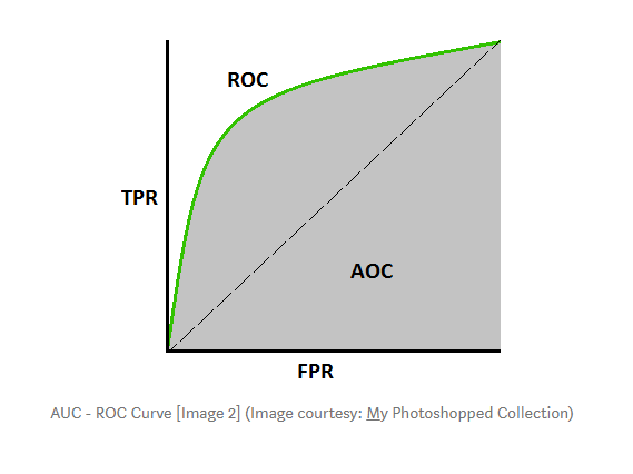
8. AUC-ROC
The ROC curve is a plot of the true positive rate (recall) against the false positive rate (TN / (TN+FP)). AUC-ROC stands for Area Under the Receiver Operating Characteristics and the higher the area, the better the model performance. If the curve is somewhere near the 50% diagonal line, it suggests that the model randomly predicts the output variable.
Again, you can compare each of those metrics in Neptune.
That’s what they do at Hypefactors, a media intelligence company:
We use Neptune for most of our tracking tasks, from experiment tracking to uploading the artifacts. A very useful part of tracking was monitoring the metrics, now we could easily see and compare those F-scores and other metrics. Andrea Duque Data Scientist at Hypefactors
You can use the charts view (like you could see in the examples I provided earlier). But you can also do it in a side-by-side table format. Here’s what it looks like:

In general, whatever metadata you log to Neptune, you’ll most likely be able to compare it. Apart from metrics and parameter comparisons, which you could see in this article, the same applies to logged images or dataset artifacts.
Here’s an overview of comparison options in the Neptune docs.
Production-based parameters
Until now we observed the comparable model features that take precedence in the development phase. Let’s dive into a few production-centric features that accelerate the production and processing time.
Time complexity
Depending on the use case, the decision to choose a model can be primarily focused on the time complexity. For example, for a real-time solution, it’s best to avoid the KNN classifier since it calculates the distance of new data points from the training points at the time of prediction which makes it slow. However, for solutions that require batch processing, a slow predictor is not a big issue.
Note that the time complexities might differ during the training and testing phases given the chosen model. For example, a decision tree has to estimate the decision points during training, whereas during prediction the model has to simply apply the conditions already available at the pre-decided decision points. So, if the solution requires frequent retraining (e.g. in a time series solution), choosing a model that has speed during both training and testing will be the way to go.
Space complexity
Citing the above example of KNN, every time the model needs to predict, it has to load the entire training data into the memory to compare distances. If the training data is sizable, this can become an expensive drain on the company’s resources (such as RAM allotted) for the particular solution or storage space. The RAM should always have enough room for processing and computation functions. Loading an overwhelming amount of data can be detrimental to the solution’s speed and processing capabilities.
Also here, Neptune proves to be useful.
Related
Andreas Malekos, Head of AI at Continuum Industries, says:
The ability to compare runs on the same graph was the killer feature, and being able to monitor production runs was an unexpected win that has proved invaluable.
You can monitor the resource usage of each experiment:

You can also create a comparison of resources for multiple experiments:

What next?
There are plenty of comparable techniques to gauge the effectiveness of the different machine learning models. However, the most important but often ignored requirement is to track the different equivalent parameters, ensuring that the results are reliable and that pipelines can be easily reproduced.
In this article, we learned a few popular methods for comparing machine learning models, but the list of these methods is much bigger. If you didn’t find the perfect method for your project here, don’t stop now—there’s plenty more to explore!
