
Data Visualisation is an essential step in any data science pipeline. Exploring your data visually opens your mind to a lot of things that might not be visible otherwise.
There are several useful libraries for doing visualization with Python, like matplotlib or seaborn. These libraries are intuitive and simple to use. There’s also pandas, which is mainly a data analysis tool, but it also provides multiple options for visualization.
Plotting with pandas is pretty straightforward. In this article, we’ll look at how to explore and visualize your data with pandas, and then we’ll dive deeper into some of the advanced capabilities for visualization with pandas.
Plotting with pandas
Pandas objects come equipped with their plotting functions. These plotting functions are essentially wrappers around the matplotlib library. Think of matplotlib as a backend for pandas plots.
The Pandas Plot is a set of methods that can be used with a Pandas DataFrame, or a series, to plot various graphs from the data in that DataFrame. Pandas Plot simplifies the creation of graphs and plots, so you don’t need to know the details of working with matplotlib.
Built-in visualization in pandas really shines in helping with fast and easy plotting of series and DataFrames.
Importing the dataset and the libraries
We’re going to work with the NIFTY-50 dataset. The NIFTY 50 index is the National Stock Exchange of India’s benchmark for the Indian equity market. NIFTY 50 stands for National Index Fifty, and represents the weighted average of 50 Indian company stocks in 17 sectors. The dataset is openly available on Kaggle, but we’ll be using a subset of the data containing the stock value of only four sectors – banking, pharma, IT, and FMCG.
You can download the sample dataset from here.
Let’s import the necessary libraries and the extracted dataset required for visualization:
# Importing required modules
import pandas as pd
import numpy as np
import matplotlib.pyplot as plt
%matplotlib inline

# Reading in the data
nifty_bank = pd.read_csv('NIFTY BANK.csv',parse_dates=["Date"])
nifty_fmcg = pd.read_csv('NIFTY FMCG.csv',parse_dates=["Date"])
nifty_IT = pd.read_csv('NIFTY IT.csv',parse_dates=["Date"])
nifty_pharma = pd.read_csv('NIFTY PHARMA.csv',parse_dates=["Date"])
%matplotlib inline ensures that the plotted figures show up correctly in the notebook when a cell is run.
A first look at NIFTY 50 data
Let’s combine the different CSV files in a single dataframe based on the ‘closing’ price of the stocks on a particular day, and filter out the data before 2020.
Let’s then look at the first few columns of the dataset:
nifty_bank_2019 = nifty_bank[nifty_bank['Date'] > '2019-12-31']
nifty_fmcg_2019 = nifty_fmcg[nifty_fmcg['Date'] > '2019-12-31']
nifty_IT_2019 = nifty_IT[nifty_IT['Date'] > '2019-12-31']
nifty_pharma_2019 = nifty_pharma[nifty_pharma['Date'] > '2019-12-31']
d = {
    'NIFTY Bank index': nifty_bank_2019['Close'].values,
    'NIFTY FMCG index': nifty_fmcg_2019['Close'].values,
    'NIFTY IT index': nifty_IT_2019['Close'].values,
    'NIFTY Pharma index': nifty_pharma_2019['Close'].values,
   }

# Inspecting the data
df = pd.DataFrame(data=d)
df.index=nifty_bank_2019['Date']
df.head()

First plot with pandas: line plots
Let’s now explore and visualize the data using pandas. To begin with, it’ll be interesting to see how the Nifty bank index performed this year.
To plot a graph using pandas, you can call the .plot() method on the dataframe. The plot method is just a simple wrapper around matplotlib’s plt.plot(). You will also need to specify the x and y coordinates to be referenced as the x and y-axis. Since the Date is already the index column, it will be configured as the X-axis.
df.plot(y='NIFTY Bank index')

As you can see above, calling the .plot() method on a dataframe returns a line plot by default. Plotting in pandas is straightforward and requires minimum settings. However, there are ways in which you can alter the output if you want, with the help of certain parameters.
Plotting parameters
The plot method has several parameters other than x and y, which can be tweaked to alter the plot.
- x and y parameters specify the values that you want on the x and y column. In the above case, these were the Date and the NIFTY Bank index column.
- figsize specifies the size of the figure object.
- Title to be used for the plot.
- legend to be placed on-axis subplots.
- Style: the matplotlib line style per column.
- X and y label: name to use for the label on the x-axis and y-axis.
- Subplots: make separate subplots for each column.
- Kind: the kind of plot to produce. We’ll look at this parameter in detail in the upcoming sections.
Let’s now plot the same dataframe with some more arguments, like specifying the figsize and labels:
df.plot(y='NIFTY Bank index',figsize=(10,6),title='Nifty Bank Index values in 2020',ylabel = 'Value');

Different plot styles in pandas
Pandas plotting methods can be used to plot styles other than the default line plot. These methods can be provided as the “kind” keyword argument to plot(). The available options are:

How do you create these plots? There are two options:
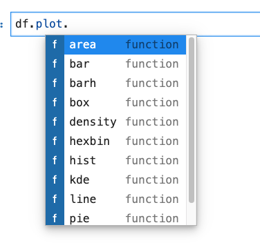
- Use the kind parameter. This parameter accepts string values and determines which kind of plot you’ll create. You can do it like this:
Dataframe.plot(kind='<kind of the desired plot e.g bar, area etc>', x,y)
- Another way to create plots is to use the method `DataFrame.plot.<kind>` instead of providing the kind keyword argument. This makes it easier to discover plot methods and the specific arguments they use:
Dataframe.plot.<kind of the desired plot e.g bar, area, etc>()
Okay, you know how to create a line plot. We’ll now look at some other plots in pandas. Note that you can create them using either of the methods shown above.
Bar plots
A bar plot is a plot that presents categorical data with rectangular bars. The lengths of the bars are proportional to the values that they represent.
To create a bar plot for the NIFTY data, you will need to resample/ aggregate the data by month-end. The pandas’ library has a resample() function, which resamples the time series data. The resample method in pandas is similar to its groupby method, as it is essentially grouping according to a specific time span. The resample() function looks like this:
df_sample = df.resample(rule = 'M').mean()[:5]
df_sample

To summarize what happened above:
- data.resample() is used to resample the stock data.
- The ‘M’ stands for month-end frequency and denotes the offset values you want to resample the data.
- mean() indicates the average stock price during this period.
Now let’s create the Bar plot as follows:
df_sample.plot(kind='bar',figsize=(10,6))

As mentioned above, you can also create the same plot without providing the ‘kind’ argument:
df_sample.plot.bar()

The choice of method is entirely up to you.
Types of bar plots
There are two types of bar plots, namely:
- Horizontal bar charts
For when you want the bars to be horizontal and not vertical. Horizontal bar charts can be created by specifying ‘barh’ as the chart type.
df_sample.plot(kind='barh',figsize=(10,6))

2. Stacked bar charts
To produce a stacked bar plot, pass stacked=True:
df_sample.plot(kind='bar',stacked=True) # for vertical barplot
df_sample.plot(kind='barh',stacked=True) # for Horizontal barplot


Histograms
A histogram is a representation of the distribution of data. Let’s create histograms for the NIFTY FMCG index and NIFTY Bank index only.
df[['NIFTY FMCG index','NIFTY Bank index']].plot(kind='hist',bins=30,alpha=0.5)
Here alpha denotes the transparency factor, and bins refer to the ranges in which data has been split. The default bin value is 10. Bin size can be changed using the “bins” keyword.

A histogram can be stacked using: stacked=True.

KDE plots
Pandas can generate a Kernel Density Estimate (KDE) plot using Gaussian kernels. A kernel density estimate plot shows the distribution of a single variable and can be thought of as a smoothed histogram.
df[['NIFTY FMCG index','NIFTY Bank index']].plot(kind='kde');

Box plots
Box plots are used for depicting data through their quartiles. A single box plot can convey a lot of information, including details about the interquartile range, median, and outliers. Let’s first create the box plots for our dataframe, and then you’ll see how to interpret them.
df.plot(kind='box',figsize=(10,6))

Here’s how you can interpret a box plot.

Anything outside the outlier points are those past the end of the whiskers. You can see that NiFTY FMCG has considerably higher outlier points than the others. Like bar plots, horizontal boxplots can also be created by specifying vert=False.
df.plot(kind='box',figsize=(10,6),vert=False)

Area plots
An area plot displays quantitative data visually.
df.plot(kind='area',figsize=(10,6));

By default, pandas create a stacked area plot, which can be unstacked by passing the value of stacked=False.
df.plot(kind='area',stacked=False,figsize=(10,6));

Scatter plot
A scatter plot is used to plot correlations between two variables. These correlations are plotted in the form of markers of varying colors and sizes. If you were to plot a scatter plot showing the relationship between NIFTY IT index and NIFTY FMCG, you’d do it like this:
df.plot(kind='scatter',x='NIFTY FMCG index', y='NIFTY Bank index',figsize=(10,6),color='Red');

Hexagonal bin plot
A hexagonal bin plot, also known as a hexbin plot, can be used as an alternative to scatterplots. This kind of plot is particularly useful when the number of data points is huge, and each point cannot be plotted individually.
df.plot(kind='hexbin',x='NIFTY FMCG index', y='NIFTY Bank index',gridsize=20,figsize=(10,6));

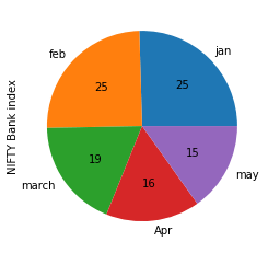
Pie plot
A pie plot is a proportional representation of numerical data in a column. Let’s take the month-end resampled data for the NIFTY Bank index, and see how it is distributed month-wise.
df_sample.index=['jan','feb','march','Apr','may']
df_sample['NIFTY Bank index'].plot.pie(legend=False, autopct='%.f');
Pie plots in pandas
The parameter autopct is used to display the percent value using Python string formatting. Legends, which are enabled by default, can be disabled by specifying legend=False. Also if the subplots=True is specified, pie plots for each column are drawn as subplots.
df_sample.plot.pie(subplots=True, figsize=(16, 10),legend=False);

Pandas plotting tools
Pandas also has a plotting module named pandas.plotting. This module consists of several plotting functions and takes in a Series or DataFrame as an argument. The following functions are contained in the pandas plotting module. The description below has been taken from pandas official documentation.

Let’s go over a few of them.
Scatter matrix plot
You have already seen how to create a scatter plot using pandas. A scatter matrix, as the name suggests, creates a matrix of scatter plots using the scatter_matrix method in pandas. Plotting:
from pandas.plotting import scatter_matrix
scatter_matrix(df, alpha=0.5, figsize=(10, 6), diagonal='kde');

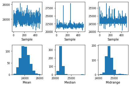
Bootstrap plot
Bootstrap plots visually assess a statistic’s uncertainty, such as mean, median, midrange, etc. Bootstrapping involves calculating a statistic by randomly sampling from the same data multiple times, and then averaging each sample’s individual result. The resultant values obtained from each random sample are then plotted in the form of line and bar charts.
pd.plotting.bootstrap_plot(df['NIFTY Bank index'])
Conclusion
In this article, we looked at the capabilities of pandas as a plotting library. We covered how to do some basic plots in pandas, and touched upon a few advanced ones like bootstrap and scatter matrix plots.
The .plot() function is a pretty powerful tool that can immediately help you get started with the data visualization process – with very few code lines. In case you want to know more about pandas’ capabilities as a plotting library, and styling and customizing your plots, the plotting section of the pandas DataFrame documentation is a great place to start.
