
There is a common business saying that you can’t improve what you don’t measure. This is true in machine learning as well. There are various tools for measuring the performance of a deep learning model: Neptune, MLflow, Weights and Biases, Guild AI, just to mention a few. In this piece, we’ll focus on TensorFlow’s open-source visualization toolkit TensorBoard.
The tool enables you to track various metrics such as accuracy and log loss on training or validation sets. As we shall see in this piece, TensorBoard provides several tools that we can use in machine learning experimentation. The tool is also fairly easy to use.
For researchers looking to improve their experimental tracking and reproducibility, neptune.ai is a useful complement to Tensorboard, providing a structured way to manage and share experimental data.
Here are some things we’ll cover in this article:
- Visualizing images in TensorBoard
- Checking model weights and biases on TensorBoard
- visualizing the model’s architecture
- sending a visual of the confusion matrix to TensorBoard
- profiling your application so as to see its performance, and
- using TensorBoard with Keras, PyTorch, and XGBoost
Let’s get to it.
💡 You may also like some of our recent video series
- AI Research Breakdown: This series invites AI researchers to break down foundational model training papers across three levels of complexity—in simple terms for young learners, at high school/university level, and in full technical depth for AI experts.
- ICML 2024: 100 Second Research Challenge: AI researchers summarize their ICML 2024 papers in under 100 seconds.
How to use TensorBoard
This section will focus on helping you understand how to use TensorBoard in your machine learning workflow.
How to install TensorBoard
Before you can start using TensorBoard you have to install it either via pip or via conda:
pip install tensorboard
conda install -c conda-forge tensorboard
Using TensorBoard with Jupyter notebooks and Google Colab
With TensorBoard installed, you can now load it into your Notebook. Note that you can use it in a Jupyter Notebook or Google’s Colab:
%load_ext tensorboard
If you need to reload the extension, the command below will do the magic — no pun intended:
%reload_ext tensorboard
To clear the current logs before writing new ones, run this command on Google Colab:
!rm -rf /logs/
or this one on Jupyter Notebooks:
rm -rf logs
If you are running multiple experiments, you might want to store all logs so that you can compare their results. This can be achieved by creating logs that are timestamped. To do that, use the command below:
import datetime
log_folder = "logs/fit/" + datetime.datetime.now().strftime("%Y%m%d-%H%M%S")
How to run TensorBoard
Running Tensorboard involves just one line of code. In this section you’ll see how to do this.
Let’s now walk through an example where you will use TensorBoard to visualize model metrics. For that purpose, you need to build a simple image classification model.
import tensorflow as tf

mnist = tf.keras.datasets.mnist
(X_train, y_train), (X_test, y_test) = mnist.load_data()
X_train, X_test = X_train / 255.0, X_test / 255.0

model = tf.keras.models.Sequential([
   tf.keras.layers.Flatten(input_shape=(28, 28)),
   tf.keras.layers.Dense(512, activation='relu'),
   tf.keras.layers.Dropout(0.2),
   tf.keras.layers.Dense(10, activation='softmax')])

model.compile(optimizer='sgd',
   loss='sparse_categorical_crossentropy',
   metrics=['accuracy'])
Next, load in the TensorBoard notebook extension and create a variable pointing to the log folder:
%load_ext tensorboard
log_folder = 'logs'
How to use TensorBoard callback
The next step is to specify the TensorBoard callback during the model’s fit method. In order to do that you first have to import the TensorBoard callback.
This callback is responsible for logging events such as Activation Histograms, Metrics Summary Plots, Profiling and Training Graph Visualizations:
from tensorflow.keras.callbacks import TensorBoard
With that in place, you can now create the TensorBoard callback and specify the log directory using log_dir. The TensorBoard callback also takes other parameters:
- histogram_freq is the frequency at which to compute activation and weight histograms for layers of the model. Setting this to 0 means that histograms will not be computed. In order for this to work you have to set the validation data or the validation split.
- write_graph dictates if the graph will be visualized in TensorBoard.
- write_images when set to true, model weights are visualized as an image in TensorBoard.
- update_freq determines how losses and metrics are written to TensorBoard. When set to an integer, say 100, losses and metrics are logged every 100 batches. When set to batch the losses and metrics are set after every batch. When set to epoch they are written after every epoch.
- profile_batch determines which batches will be profiled. By default, the second batch is profiled. You can also set, for example from 5 and to 10, to profile batches 5 to 10, i.e profile_batch=’5,10′ . Setting profile_batch to 0 disables profiling.
- embeddings_freq the frequency at which the embedding layers will be visualized. Setting this to zero means that the embeddings will not be visualized.
callbacks = [TensorBoard(log_dir=log_folder,
                         histogram_freq=1,
                         write_graph=True,
                         write_images=True,
                         update_freq='epoch',
                         profile_batch=2,
                         embeddings_freq=1)]
The next item is to fit the model and pass in the callback:
model.fit(X_train, y_train,
          epochs=10,
          validation_split=0.2,
          callbacks=callbacks)
How to launch TensorBoard
If you installed TensorBoard via pip, you can launch it via the command line:
tensorboard -- logdir=logOn a Notebook, you can launch it using:
%tensorboard -- logdir={log_folder}The TensorBoard is also available via the browser using the following URL:
http://localhost:6006
Running TensorBoard remotely
When working on a remote server, you can use SSH tunneling to forward the port of the remote server to your local machine at port (port 6006 in this example). This is how this would look like:
ssh -L 6006:127.0.0.1:6006 your_user_name@my_server_ip --port=6006
With that inplace, you can run the TensorBoard in the normal way.
Just remember that the port you specify in the tensorboard command (by default it is 6006) should be the same as the one in the ssh tunneling.
tensorboard --logdir=/tmp --port=6006Note: If you are using the default port 6006 you can drop –port=6006. You will be able to see the TensorBoard on the local machine but TensorBoard will actually be running on the remote server.
TensorBoard dashboard
Tensorboard offers a suite of powerful visualizations to assess your model’s performance, architecture and training process. Now let’s explore the key tabs and their functionalities.
TensorBoard scalars
The Scalars tab shows changes in the loss and metrics over the epochs. It can be used to track other scalar values such as learning rate and training speed.

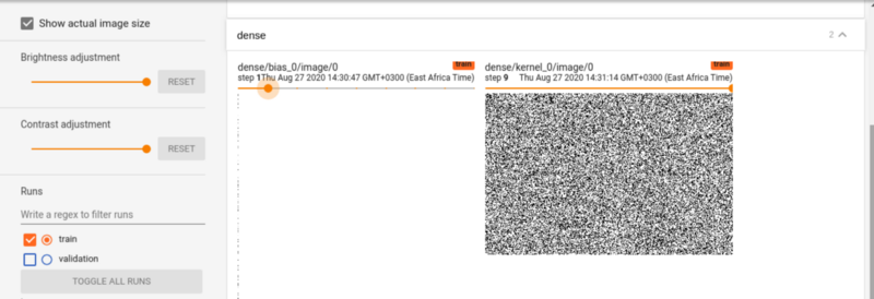
TensorBoard images
This dashboard displays images that represent the weights. Adjusting the slider we can visualize the weights at various epochs.
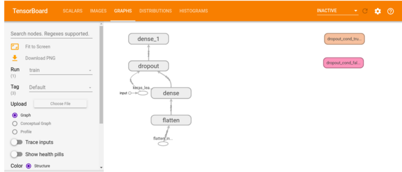
TensorBoard graphs
This tab shows your model’s layers. You can use this to check if the architecture of the model looks as intended.
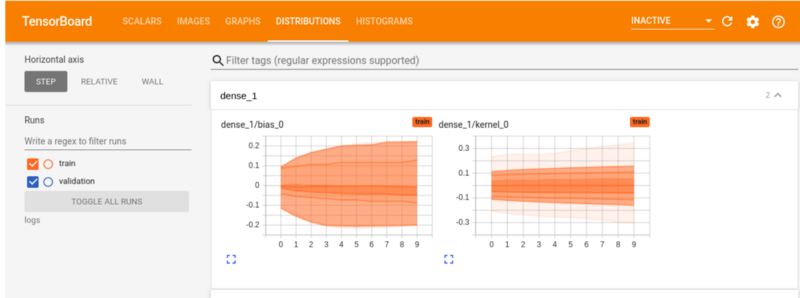
TensorBoard distributions
The distribution tab shows the distribution of tensors. For example in the dense layer below, you can see the distribution of the weights and biases over each epoch.
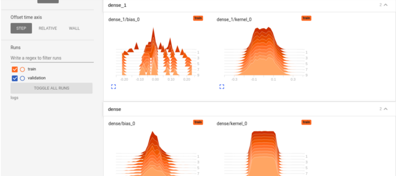
TensorBoard histograms
The Histograms show the distribution of tensors over time. For example, looking at dense_1 below, you can see the distribution of the biases over each epoch.
How to Do Model Visualization in Machine Learning?
Using the TensorBoard projector
You can use TensorBoard’s Projector to visualize any vector representation e.g. word embeddings and images.
Words embeddings are numerical representations of words that capture their semantic relationship. The projector helps you see those representations. You can find it under the Inactive dropdown.
Plot training examples with TensorBoard
You can use TensorFlow Image Summary API to visualize training images. This is especially useful when working with image data like in this case.
Now, create a new log directory for the images as shown below:
logdir = "logs/train_data/"The next step is to create a file writer and point it to this directory:
file_writer = tf.summary.create_file_writer(logdir)
At the beginning of this article (in the “How to run TensorBoard” section), we specified that the image shape was 28×28. It is important information when reshaping the images before writing them to TensorBoard. You also need to specify the channel to be 1 because the images are grayscale. Afterward, you use the file_write to write the images to TensorBoard.
In this example, the images at index 10 to 30 will be written to TensorBoard:
import numpy as np

with file_writer.as_default():
    images = np.reshape(X_train[10:30], (-1, 28, 28, 1))
    tf.summary.image("20 Digits", images, max_outputs=25, step=0)
Visualize images in TensorBoard
Apart from visualizing image tensors, you can also visualize actual images in TensorBoard. In order to illustrate that, you need to convert the MNIST tensors to images using Matplotlib. After that, you need to use tf.summary.image to plot the images in Tensorboard.
Start by clearing the logs, alternatively you can use timestamped log folders. After that specify the log directory and create a tf.summary.create_file_writer that will be used to write the images to TensorBoard:
!rm -rf logs # if Juypter Notebook remove !import io
import matplotlib.pyplot as plt
class_names = ['Zero','One','Two','Three','Four','Five','Six','Seven','Eight','Nine']
logdir = "logs/plots/"
file_writer = tf.summary.create_file_writer(logdir)
Next, create a grid that will hold the images. In this case, the grid will hold 36 digits:
def image_grid():
    figure = plt.figure(figsize=(12,8))

    for i in range(36):
        plt.subplot(6, 6, i + 1)
        plt.xlabel(class_names[y_train[i]])
        plt.xticks([])
        plt.yticks([])
        plt.grid(False)
        plt.imshow(X_train[i], cmap=plt.cm.coolwarm)

    return figure

figure = image_grid()
Now convert the digits into a single image to visualize it in the TensorBoard:
def plot_to_image(figure):
    buf = io.BytesIO()
    plt.savefig(buf, format='png')
    plt.close(figure)
    buf.seek(0)

    digit = tf.image.decode_png(buf.getvalue(), channels=4)
    digit = tf.expand_dims(digit, 0)

    return digit
The next step is to use the writer and plot_to_image to display the images on TensorBoard:
with file_writer.as_default():
    tf.summary.image("MNIST Digits", plot_to_image(figure), step=0)
%tensorboard -- logdir logs/plots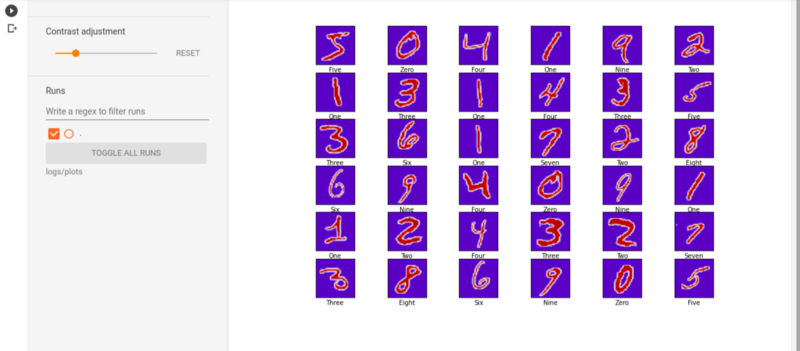
Log confusion matrix to TensorBoard
Using the same example, you can log the confusion matrix for all epochs. First, define a function that will return a Matplotlib figure holding the confusion matrix:
import itertools

def plot_confusion_matrix(cm, class_names):
    figure = plt.figure(figsize=(8, 8))
    plt.imshow(cm, interpolation='nearest', cmap=plt.cm.Accent)
    plt.title("Confusion matrix")
    plt.colorbar()
    tick_marks = np.arange(len(class_names))
    plt.xticks(tick_marks, class_names, rotation=45)
    plt.yticks(tick_marks, class_names)

    cm = np.around(cm.astype('float') / cm.sum(axis=1)[:, np.newaxis], decimals=2)
    threshold = cm.max() / 2.

    for i, j in itertools.product(range(cm.shape[0]), range(cm.shape[1])):
        color = "white" if cm[i, j] > threshold else "black"
        plt.text(j, i, cm[i, j], horizontalalignment="center", color=color)

    plt.tight_layout()
    plt.ylabel('True label')
    plt.xlabel('Predicted label')

    return figure
Next, clear the previous logs, define the log directory for the confusion matrix, and create a writer variable for writing into the log folder.
!rm -rf logslogdir = "logs"
file_writer_cm = tf.summary.create_file_writer(logdir)The step that follows this is to create a function that will make predictions from the model and log the confusion matrix as an image.
After that use the file_writer_cm to write the confusion matrix to the log directory.
from tensorflow import keras
from sklearn import metrics

def log_confusion_matrix(epoch, logs):
    predictions = model.predict(X_test)
    predictions = np.argmax(predictions, axis=1)

    cm = metrics.confusion_matrix(y_test, predictions)
    figure = plot_confusion_matrix(cm, class_names=class_names)
    cm_image = plot_to_image(figure)

    with file_writer_cm.as_default():
        tf.summary.image("Confusion Matrix", cm_image, step=epoch)
This will be followed by the definition of the TensorBoard callback and the LambdaCallback.
The LambdaCallback will log the confusion matrix on every epoch. Finally fit the model using these two callbacks.
Since you’ve already fitted the model before, it would be advisable to restart your runtime and ensure that you are fitting the model just once:
callbacks = [
   TensorBoard(log_dir=log_folder,
               histogram_freq=1,
               write_graph=True,
               write_images=True,
               update_freq='epoch',
               profile_batch=2,
               embeddings_freq=1),
   keras.callbacks.LambdaCallback(on_epoch_end=log_confusion_matrix)
]

model.fit(X_train, y_train,
          epochs=10,
          validation_split=0.2,
          callbacks=callbacks)
Now run TensorBoard and check the confusion matrix on the Images tab:
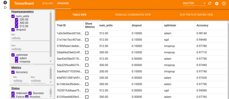
%tensorboard -- logdir logsHyperparameter tuning with TensorBoard
Another cool thing you can do with TensorBoard is use it to visualize parameter optimization. Sticking to the same MNIST example, you can attempt to tune the hyperparameters of the model (manually or using automated hyperparameter optimization) and visualize them in TensorBoard.
Here’s the final result that you expect to obtain. The dashboard is available under the HPARAMS tab.
To achieve this you have to clear the previous logs and import the hparams plugin.
!rm -rvf logs
logdir = "logs"

from tensorboard.plugins.hparams import api as hp
Hyperparameter Tuning in Python: a Complete Guide
The next step is to define the parameters to tune: the units in the dense layer, the dropout rate, and the optimizer function:
HP_NUM_UNITS = hp.HParam('num_units', hp.Discrete([300, 200,512]))
HP_DROPOUT = hp.HParam('dropout', hp.RealInterval(0.1,0.5))
HP_OPTIMIZER = hp.HParam('optimizer', hp.Discrete(['adam', 'sgd', 'rmsprop']))
Next, use the tf.summary.create_file_writer to define the folder where the logs will be stored:
METRIC_ACCURACY = 'accuracy'

with tf.summary.create_file_writer('logs/hparam_tuning').as_default():
    hp.hparams_config(
        hparams=[HP_NUM_UNITS, HP_DROPOUT, HP_OPTIMIZER],
        metrics=[hp.Metric(METRIC_ACCURACY, display_name='Accuracy')],)
With that out of the way, you need to define the model as you did previously. The only difference is that the number of neurons in the first dense layer, the drop out rate, and the optimizer function won’t be hardcoded.
This will be done in a function that will be used later, while running the experiments:
def create_model(hparams):
    model = tf.keras.models.Sequential([
        tf.keras.layers.Flatten(input_shape=(28, 28)),
        tf.keras.layers.Dense(hparams[HP_NUM_UNITS],  activation='relu'),
        tf.keras.layers.Dropout(hparams[HP_DROPOUT]),
        tf.keras.layers.Dense(10, activation='softmax')])

    model.compile(optimizer=hparams[HP_OPTIMIZER],
                  loss='sparse_categorical_crossentropy',
                  metrics=['accuracy'])

    model.fit(X_train, y_train, epochs=5)
    loss, accuracy = model.evaluate(X_test, y_test)

    return accuracy
The next function you need to create will run the function above using the parameters defined earlier. It will then log the accuracy.
def experiment(experiment_dir, hparams):

    with tf.summary.create_file_writer(experiment_dir).as_default():
        hp.hparams(hparams)
        accuracy = create_model(hparams)
        tf.summary.scalar(METRIC_ACCURACY, accuracy, step=1)
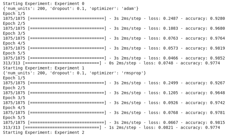
After this, you need to run this function for all combinations of the parameters defined above. Each of the experiments will be stored in its own folder:
experiment_no = 0

for num_units in HP_NUM_UNITS.domain.values:
    for dropout_rate in (HP_DROPOUT.domain.min_value, HP_DROPOUT.domain.max_value):
        for optimizer in HP_OPTIMIZER.domain.values:
            hparams = {
                HP_NUM_UNITS: num_units,
                HP_DROPOUT: dropout_rate,
                HP_OPTIMIZER: optimizer,}

            experiment_name = f'Experiment {experiment_no}'
            print(f'Starting Experiment: {experiment_name}')
            print({h.name: hparams[h] for h in hparams})
            experiment('logs/hparam_tuning/' + experiment_name, hparams)
            experiment_no += 1
Finally, run TensorBoard to see the visualization displayed at the beginning of this section.
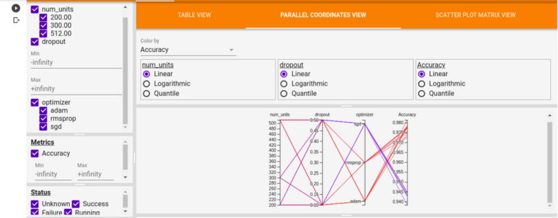
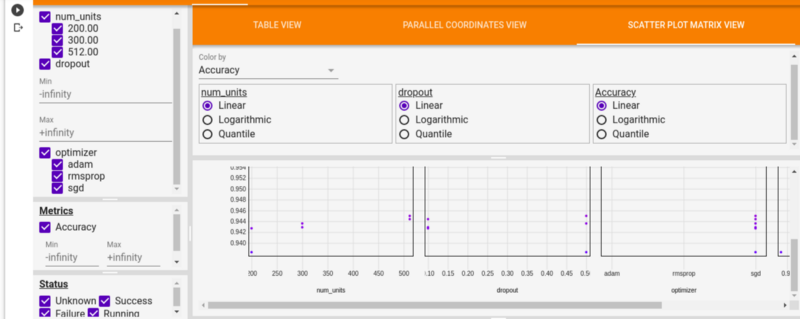
%tensorboard -- logdir logs/hparam_tuningOn the HPARAMS tab, the Table View shows all the model runs and their corresponding accuracy, dropout rate, and dense layer neurons. The Parallel Coordinates View shows every run as a line moving through an axis for each of the hyperparameters and accuracy metric.
Clicking one of them will display the trials and hyperparameters as shown below:

The Scatter Plot View visualizes the comparison between the hyperparameters and the metrics.
TensorFlow Profiler
You can also track the performance of TensorFlow models using Profiler. Profiling is crucial to understand the hardware resources consumption of TensorFlow operations. Before you can do that you have to install the profiler plugin.
pip install -U tensorboard-plugin-profile
Once it’s installed, it will be available under the Inactive dropdown. Here’s a snapshot of one of the many visuals seen on the profiler.
The only thing you have to do now is to define a callback and include the batches that will be profiled.
After that, you pass the callback as you fit the model. Don’t forget to call TensorBoard so that you can see the visualizations.
callbacks = [tf.keras.callbacks.TensorBoard(log_dir=log_folder,
                                            profile_batch='10,20')]

model.fit(X_train, y_train,
          epochs=10,
          validation_split=0.2,
          callbacks=callbacks)
%tensorboard --logdir=logs
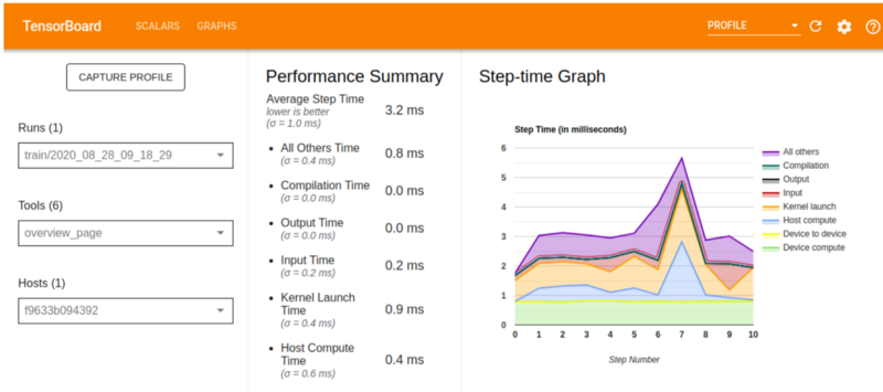
Overview page
The Overview Page on the Profile Tab shows a high-level overview of the model’s performance. As you can see from the image below, the Performance Summary shows:
- time spent compiling the kernels,
- time spent reading the data,
- time spent launching the kernels,
- time spent in producing the output,
- on-device compute time,
- host compute time.
The Step Time Graph shows a visual of device step time over all the steps that have been sampled. The different colors on the graph portray the various categories where time is spent:
- The red portion corresponds to the step time where the devices were idle as they waited for input data.
- The green part displays the amount of time that the device was actually working.
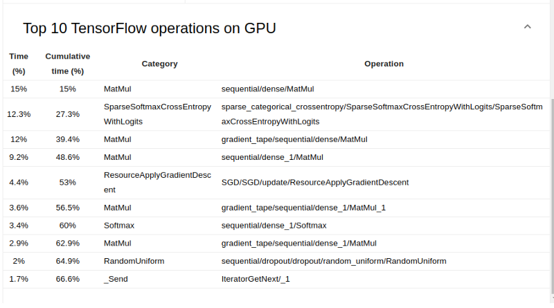
Still, on the overview page, you can see the TensorFlow operations that took the longest to run.
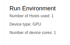
The Run environment shows the environment information such as the number of hosts used, device type, and the number of device cores. In case, you can see that there is 1 host with a GPU containing 1 core on the Colab’s runtime.
Another thing you can see from this page is recommendations for optimizing the performance of the model.

Trace viewer
The Trace Viewer can be used to understand performance bottlenecks in the input pipeline. It shows a timeline for different events that happened on the GPU or CPU during the period of profiling.
On the vertical axis, it shows various event groups and event traces on the horizontal axis. In the image below I have used the keyboard shortcut w to zoom in the events. To zoom out, use the keyboard shortcut S. A and D can be used to move to the left and right respectively.
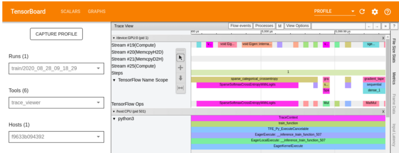
You can click on an individual event to analyze it further. Use the cursor on the floating toolbar or use the keyboard shortcut 1.
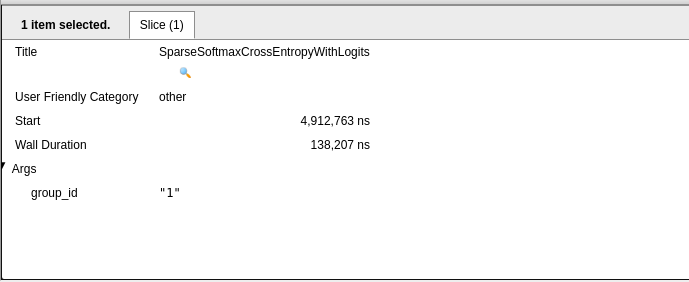
The image below shows the result of analyzing the SparseSoftmaxCrossEntropyWithLogits event (calculation of the loss on a batch of data) that shows the start and wall duration.
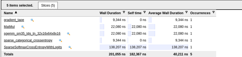
You can also check the summary of various events by holding onto the Ctrl key and selecting them.
Input pipeline analyzer
The Input Pipeline Analyzer can be used to analyze inefficiencies in the input pipeline of your model.

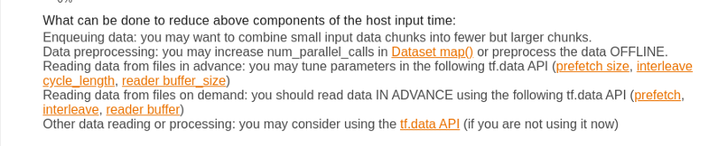
The functionality shows the Summary of input-pipeline analysis, Device-side analysis details, and the Host-side analysis details.
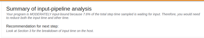
The Summary of input-pipeline analysis shows the overall input pipeline. It is the part that informs whether the application is input bound and by how much.
The Device-side analysis details show the device step-time and the device time spent waiting for input data.
The Host-side Analysis displays analysis on the host side such as a breakdown of the input processing time on the host.
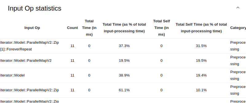
On the Input Pipeline Analyzer, you can also see statistics about individual input operations, the time taken and their category. Here’s what the various columns represent:
- Input Op — the TensorFlow operation name for the input operation
- Count — the number of instances of the operation execution during the profiling time
- Total Time — the cumulative sum of time spent on each instance mentioned above
- Total Time % — is the total time spent on an operation as a percentage of the total time spent on input processing
- Total Self Time — the cumulative sum of the self-time spent on each instance.
- Total Self Time % — the total self-time as a percentage of the total time spent on input processing
- Category — the processing category of the input operation
TensorFlow stats
This dashboard shows the performance of every TensorFlow operation that has been executed on the host.
- The first pie chart shows the distribution of the self-execution time of each operation on the host.
- The second one shows the distribution of self-execution time on each operation type on the host.
- The third displays the distribution of the self-execution time of each operation on the device.
- The fourth one displays the distribution of the self-execution time on each operation type on the device.
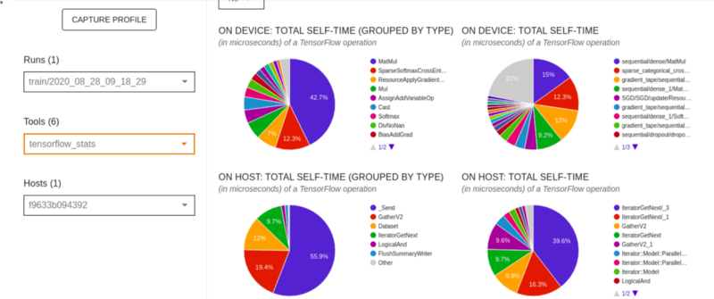
The table below the pie charts shows the TensorFlow operations. Each row is an operation, and the columns show various aspects of each operation. You can filter the table using any of the columns.
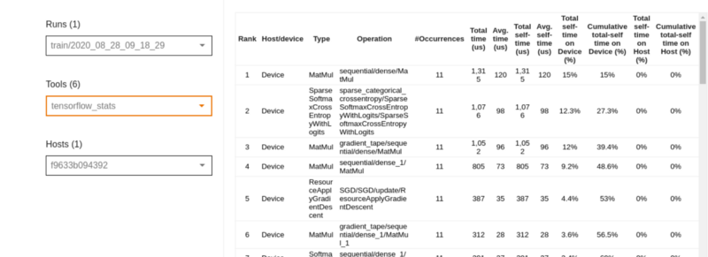
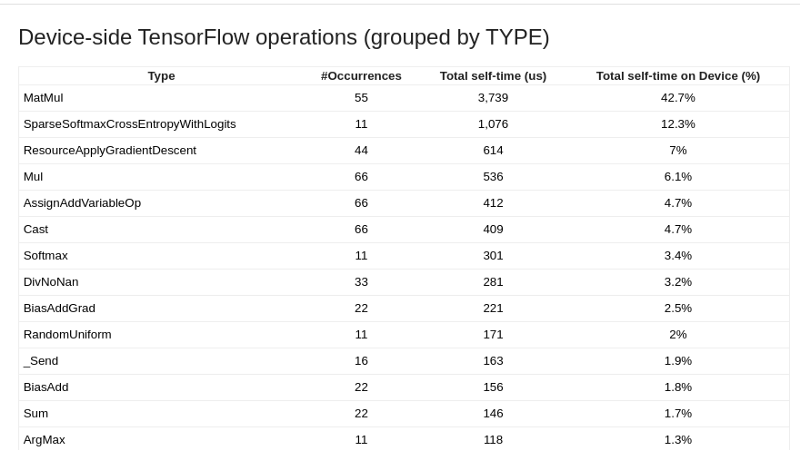
Below the table above you can see various TensorFlow operations grouped by the type.
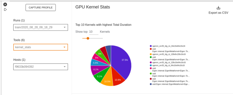
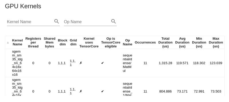
GPU kernel stats
This page shows performance statistics and the originating operation for each GPU accelerated kernel. This chart is useful to identify performance bottlenecks and optimize kernel execution efficiency.

Below the Kernel Stats is a table that shows among other things, the kernels, and time spent on various operations.
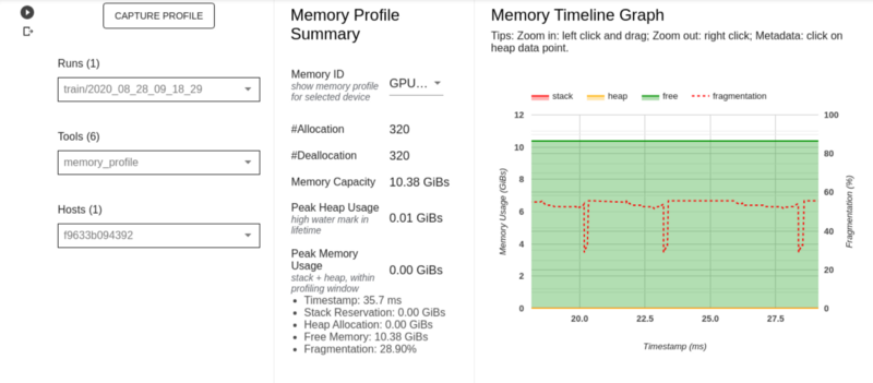
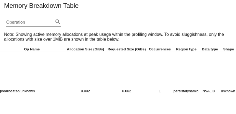
Memory profile page
This page shows the utilization of memory during the profiling period. It has the following sections; Memory Profile Summary, Memory Timeline Graph, and Memory Breakdown Table.
- The Memory Profile Summary shows a summary of the memory profile of the TensorFlow application.
- The Memory Timeline Graph shows a plot of the memory usage in GiBs and the percentage of fragmentation versus time in milliseconds.
- The Memory Breakdown Table displays the active memory allocations at the point of the highest memory usage in the profiling interval.
How to enable debugging on TensorBoard
You can also send debug information to your TensorBoard. To do that, you have to enable debug – it is still in the experimental mode:
tf.debugging.experimental.enable_dump_debug_info(
   logdir,
   tensor_debug_mode="FULL_HEALTH",
   circular_buffer_size=-1)
The Dashboard can be viewed on Debugger V2 under the Inactive dropdown.
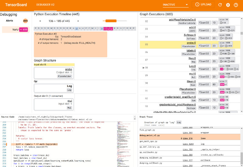
The Debugger V2 GUI has Alerts, Python Execution Timeline, Graph Execution, and Graph Structure. The Alerts section shows your program’s anomalies. The Python Execution Timeline section shows the history of the eager execution of operations and graphs.
The Graph Execution displays the history of all the floating-dtype tensors that have been computed inside graphs. The Graph Structure section has the Source Code and Stack Trace that are populated as you interact with the GUI.
Using TensorBoard with deep learning frameworks
You are not limited to using TensorBoard with TensorFlow alone. You can also use it with other frameworks such as Keras, PyTorch and XGBoost, just to mention a few.
TensorBoard in PyTorch
Start by defining a writer pointing to the folder where you would like to have the logs written:
from torch.utils.tensorboard import SummaryWriter

writer = SummaryWriter(log_dir='logs')
The next step is to add the items you would like to see on TensorBoard using the summary writer.
from torch.utils.tensorboard import SummaryWriter
import numpy as np

for n_iter in range(100):
    writer.add_scalar('Loss/train', np.random.random(), n_iter)
    writer.add_scalar('Loss/test', np.random.random(), n_iter)
    writer.add_scalar('Accuracy/train', np.random.random(), n_iter)
    writer.add_scalar('Accuracy/test', np.random.random(), n_iter)
TensorBoard in Keras
Since TensorFlow uses Keras as the official high level API, the TensorBoard implementation is similar to its implementation in TensorFlow. We have already seen how to do this:
Create a callback:
from tensorflow.keras.callbacks import TensorBoard

tb_callback = TensorBoard(log_dir=log_folder,...)
Pass it to model.fit:
model.fit(X_train, y_train,
          epochs=10,
          validation_split=0.2,
          callbacks=[tb_callback])
TensorBoard in XGBoost
When working with XGBoost, you can also log events to TensorBoard. The tensorboardX package is required for that. For example, to log metrics and losses you can use SummaryWriter and log scalars:
from tensorboardX import SummaryWriter

def TensorBoardCallback():
    writer = SummaryWriter()

    def callback(env):
        for k, v in env.evaluation_result_list:
            writer.add_scalar(k, v, env.iteration)

    return callback

xgb.train(callbacks=[TensorBoardCallback()])
Collaboration features in TensorBoard
In research and academia, experiment tracking is not just about logging metrics and visualizing results—it’s also about sharing findings with colleagues, supervisors, and within research papers. TensorBoard offers some built-in ways to extract and share experiment data:
- Downloading scalars and metrics: Users can export scalars as CSV files, allowing them to process and share results in spreadsheets or other reporting tools.
- Saving visualizations: Graphs and performance curves can be manually saved as images for your research papers or presentations.
While these options provide some flexibility, they often require additional workarounds to achieve effective collaboration, especially when dealing with multiple runs or large-scale experiments.
neptune.ai is a useful complementary solution to TensorBoard, as it offers built-in collaboration features for these scenarios. Unlike TensorBoard’s limited sharing capabilities, Neptune allows:
- Live experiment sharing: Users can invite collaborators to view, analyze, and comment on their runs in real-time.
- Automated logging and versioning: Every experiment is stored in the cloud with full traceability, making it easy to reference previous results.
- Direct integration with papers: Researchers can easily export charts and results to integrate them directly into publications.
- Team dashboards and reports: Share structured experiment dashboards with supervisors and teams, reducing the need for manual reporting.
Editor’s note
Join 1000s of researchers, professors, students, and Kagglers using neptune.ai for free to make monitoring experiments, comparing runs, and sharing results far easier than with open source tools.
-

Learn more about the program
-
See the docs or watch a short product demo (2 min)
Limitations of using TensorBoard
As you have seen, TensorBoard gives you a lot of great features. That said, using TensorBoard is not all rosy. Let’s see some limitations and how they can be addressed:
Limited capabilities for experiment management
One of the main challenges is the lack of integrated experiment management. Keeping track of multiple runs, comparing models and organising metadata can become overwhelming.
A better approach is to organize and compare different experiment runs using an external experiment management system like Neptune, MLFlow or Weights & Biases.
Lack of collaboration features
Collaboration is another area where TensorBoard falls short. Since it’s designed for local visualization, sharing logs and results requires manual work, such as exporting images or sharing log files. This isn’t ideal for research teams or businesses that need real-time collaboration. With more team-oriented tools like Neptune, users can log experiment results to a cloud-hosted dashboard, allowing team members to access and review results from anywhere.
Scalability issues with large experiments
TensorBoard struggles with scalability, especially when tracking a large number of experiments or handling high-dimensional data. For example, a deep learning research team working on hyperparameter optimization might run thousands of experiments in parallel. As logs accumulate, TensorBoard’s interface can slow down significantly, making it difficult to navigate results efficiently.
An alternative for teams dealing with large-scale workflows is to use BigQuery or Elasticsearch to store logs in a structured format that enables fast querying and retrieval. Another approach is to adopt cloud-based experiment tracking solutions like Neptune. These tools allow researchers to filter and search logs dynamically, making large-scale experimentation more manageable.
Additionally, structured databases like PostgreSQL with JSON support or Apache Cassandra are sometimes leveraged to maintain historical experiment records efficiently, ensuring reproducibility and better analysis over time.
Limited support for advanced metadata and custom formats
TensorBoard focuses mainly on standard metrics such as scalars, images, and histograms. However, it lacks support for custom metadata types, including complex structured data, dataset versioning, and real-time monitoring of logs. Some teams overcome this by using additional logging frameworks such as Apache Kafka for streaming logs, or external tracking tools that support a broader range of metadata storage.
No built-in model versioning and checkpoint management
TensorBoard does not support native model checkpointing or versioning, making it difficult to track the evolution of a model over time and revert to previous states when needed.
In production-oriented workflows, teams often rely on dedicated model versioning tools like DVC (Data Version Control) to systematically track and store different versions of a trained model. This ensures that past models can be retrieved, compared, and even rolled back if necessary.
The Best TensorBoard Alternatives
Final thoughts
There are a couple of things we haven’t covered in this piece. Two interesting features that are worth mentioning are:
- The Fairness Indicators Dashboard (currently in Beta). It allows for computation of fairness metrics for binary and multiclass classifiers.
- The What-If Tool (WIT) enables you to explore and investigate trained machine learning models. This is done using a visual interface that doesn’t require any code.
Hopefully with everything you have learned here you will monitor and debug your training runs and ultimately build better models!
