Machine learning models are powerful and complex mathematical structures. Understanding their intricate workings is a crucial aspect of model development. Model visualization in machine learning is essential for gaining insights, making informed decisions, and effectively communicating results.
In this article, we’ll delve into the art of machine learning visualization, exploring various techniques that help us make sense of complex data-driven systems. I have also prepared a Google Colab notebook with visualization examples to try yourself.
So, without further ado, let’s get started.
What is visualization in machine learning?
Machine learning visualization (ML visualization for short) generally refers to the process of representing machine learning models, data, and their relationships through graphical or interactive means. The goal is to make comprehending a model’s complex algorithms and data patterns easier, making it more accessible to technical and non-technical stakeholders.
Visualization bridges the gap between the enigmatic inner workings of ML models and our innate human capacity for understanding patterns and relationships through visuals.
Visualizing ML models can help with a wide range of objectives:
- Model structure visualization: Common model types, such as decision trees, support vector machines, or deep neural networks, often consist of many layers of computations and interactions that are challenging to grasp for humans. Visualization lets us see more easily how data flows through a model and where transformations occur.
- Visualizing performance metrics: Once we have trained a model, we need to assess its performance. Visualizing metrics such as accuracy, precision, recall, and the F1 score helps us see how well our model is doing and where improvements are needed.
- Comparative model analysis: When dealing with multiple models or algorithms, visualization of differences in structure or performance allows us to choose the best one for a particular task.
- Feature importance: It is vital to understand which features influence a model’s predictions the most. Visualization techniques like feature importance plots make identifying the critical factors driving model outcomes easy.
- Interpretability: Due to their complexity, ML models are often “black boxes” to their human creators, making it hard to explain their decisions. Visualizations can shed light on how specific features affect the output or how robust a model’s predictions are.
- Communication: Visualizations are a universal language for conveying complex ideas simply and intuitively. They are essential for effectively sharing information with management and other non-technical stakeholders.

Model structure visualization
Understanding how data flows through a model is essential in understanding how a machine learning model transforms the input features into its output.
Decision tree visualization
Decision trees have a flowchart-like structure that’s familiar to most people. Each internal node represents a decision based on the value of a specific feature. Each branch from a node signifies an outcome of that decision. The Leaf nodes represent the model’s outputs.
Visualization of this structure offers a straightforward representation of the decision-making process, enabling data scientists and business stakeholders alike to comprehend the decision rules the model has learned.
During training, a decision tree identifies the feature that best separates the samples in a branch based on a specific criterion, often the Gini impurity or information gain. In other words, it determines the most discriminative feature.
Visualizing decision trees (or their ensembles like random forests or gradient-boosted trees) involves a graphical rendering of their overall structure, displaying the splits and decisions at each node clearly and intuitively. The depth and width of the tree, as well as the leaf nodes, become evident at first sight. Moreover, decision tree visualization aids in identifying crucial features, the most discriminative attributes that lead to accurate predictions.
The path to accurate prediction can be summed in four steps:
- Feature Clarity: Decision tree visualization is like peeling back layers of complexity to reveal the pivotal features at play. It’s akin to looking at a decision-making flowchart, where each branch signifies a feature, and each decision node holds a crucial aspect of our data.
- Discriminative Attributes: The beauty of a decision tree visualization lies in its ability to highlight the most discriminative features. These factors heavily influence the outcome, guiding the model in making predictions. Through visualizing the tree, we can pinpoint these features and thus understand the core factors driving our model’s decisions.
- Path to Precision: Every path down the decision tree is a journey towards precision. The visualization showcases the sequence of decisions that lead to a particular prediction. This is gold for understanding the logic and criteria our model uses to reach specific conclusions.
- Simplicity Amidst Complexity: Despite the complexity of machine learning algorithms, decision tree visualization comes with an element of simplicity. It transforms intricate mathematical calculations into an intuitive representation, making it accessible to technical and non-technical stakeholders.

The diagram above shows the structure of a decision tree classifier trained on the famous Iris dataset. This dataset consists of 150 samples of iris flowers, each belonging to one of three species: setosa, versicolor, or virginica. Each sample has four features: sepal length, sepal width, petal length, and petal width.
From the decision tree visualization, we can understand how the model classifies a flower:
- Root node: At the root node, the model determines whether the petal length is 2.45 cm or less. If so, it classifies the flower as setosa. Otherwise, it moves on to the next internal node.
- Second split based on petal length: If the petal length is greater than 2.45 cm, the tree again uses this feature to make a decision. The decision criterion is whether the petal length is less than or equal to 4.75 cm.
- Split based on petal width: If the petal length is less than or equal to 4.75 cm, the model next considers the petal width and determines whether it is above 1.65 cm. If so, it classifies the flower as virginica. Otherwise, the model’s output is versicolor.
- Split based on sepal length: If the petal length is greater than 4.75 cm, the model determined during training that sepal length is best suited to distinguish versicolor from virginica. If the sepal length is greater than 6.05 cm, it classifies the flower as virginica. Otherwise, the model’s output is versicolor.
The visualization captures this hierarchical decision-making process and represents it in a way that is easier to understand than a simple listing of decision rules.
Ensemble model visualization
Ensemble approaches like random forests, AdaBoost, gradient boosting, and bagging combine multiple simpler models (called base models) into one larger, more accurate model. For example, a random forest classifier comprises many decision trees. Understanding the comprising models’ contributions and complex interplay is crucial when debugging and assessing ensembles.
One way to visualize an ensemble model is to create a diagram showing how the base models contribute to the ensemble model’s output. A common approach is to plot the base models’ decision boundaries (also called surfaces), highlighting their influence across different parts of the feature space. By examining how these decision boundaries overlap, we can learn how the base models give rise to the collective predictive power of the ensemble.

Ensemble model visualizations also help users better comprehend the weights assigned to each base model within the ensemble. Typically, base models have a strong influence in some regions of the feature space and little influence in others. However, there might also be base models that never contribute significantly to the ensemble’s output. Identifying base models with particularly low or high weights can help to make ensemble models more robust and improve their generalizability.
Visually building models
Visual ML is an approach to designing machine-learning models using a low-code or no-code platform. It enables users to create and modify complex machine-learning processes, models, and outcomes through a user-friendly visual interface. Instead of retroactively generating model structure visualizations, Visual ML places them at the heart of the ML workflow.
In a nutshell, Visual ML platforms offer drag-and-drop model-building workflows that allow users of various backgrounds to create ML models easily. They bridge the gap between the abstract world of algorithms and our innate ability to grasp patterns and relationships through visuals.
These platforms can save us time and help us build model prototypes quickly. Since models can be created in minutes, training and comparing different model configurations is easy. The model which performs best can then be optimized further, perhaps using a more code-centric approach.
Data scientists and machine learning engineers can make use of Visual ML tools to create:
- 1 Experimental prototypes
- 2 MLOps pipelines
- 3 Generate optimal ML code for production
- 4 Scale the existing ML model codebase for a larger sample

Examples of Visual ML tools are TensorFlow’s Neural Network Playground and KNIME, an open-source data science platform built entirely around Visual ML and No-Code concepts.
Visualize machine learning model performance
In many cases, we do not care so much about how a model works internally but are interested in understanding its performance. For which kinds of samples is it reliable? Where does it frequently draw the wrong conclusions? Should we go with model A or model B?
In this section, we’ll look at machine learning visualizations that help us better understand a model’s performance.
Confusion matrices
Confusion matrices are a fundamental tool for evaluating a classification model’s performance. A confusion matrix compares a model’s predictions with the ground truth, clearly showing what kind of samples a model misclassifies or where it struggles to distinguish between classes.
In the case of a binary classifier, a confusion matrix has just four fields: true positives, false positives, false negatives, and true negatives:
|
|
Model predicts: 0
|
Model predicts: 1
|
|
True value: 0 |
true negative |
false positive |
|
True value: 1 |
false negative |
true positive |
Equipped with this information, it’s straightforward to calculate essential metrics like precision, recall, F1 score, and accuracy.
The confusion matrix for a multi-class model follows the same general idea. The diagonal elements represent correctly classified instances (i.e., the model’s output matches the ground truth), while off-diagonal elements signify misclassifications.
Here is a small snippet to generate a confusion matrix for a sci-kit-learn classifier:
import matplotlib.pyplot as plt
from sklearn.datasets import make_classification
from sklearn.metrics import confusion_matrix, ConfusionMatrixDisplay
from sklearn.model_selection import train_test_split
from sklearn.svm import SVC


# generate some sample data
X, y = make_classification(n_samples=1000,
n_features=10,
n_informative=6,
n_redundant = 2,
n_repeated = 2,
n_classes = 6,
n_clusters_per_class=1,
random_state = 42
)


# split the data into train and test set
X_train, X_test, y_train, y_test = train_test_split(X, y,random_state=0)


# initialize and train a classifier
clf = SVC(random_state=0)
clf.fit(X_train, y_train)


# get the model’s prediction for the test set
predictions = clf.predict(X_test)


# using the model’s prediction and the true value,
# create a confusion matrix
cm = confusion_matrix(y_test, predictions, labels=clf.classes_)


# use the built-in visualization function to generate a plot
disp = ConfusionMatrixDisplay(confusion_matrix=cm, display_labels=clf.classes_)
disp.plot()
plt.show()

Let’s have a look at the output. As mentioned before, the elements in the diagonal represent the true class, and the off-diagonal elements represent cases where the model confuses classes – hence the name “confusion matrix.”
Here are three key takeaways from the plot:
- Diagonal: Ideally, the matrix’s main diagonal should be populated with the highest numbers. These numbers represent the instances where the model correctly predicted the class, aligning with the true class. Looks like our model is doing pretty well here!
- Off-diagonal entries: The numbers outside the main diagonal are equally important. They reveal cases where the model made errors. For example, if you look at the cell where row 5 intersects with column 3, you’ll see that there were five cases where the true class was “5”, but the model predicted class “3”. Perhaps we should look at the affected samples to better understand what’s going on here!
- Analyzing performance at a glance: By examining the off-diagonal entries, you can see immediately that they’re quite low. Overall, the classifier seems to do a pretty good job. You’ll also notice that we have about an equal number of samples for each category. In many real-world scenarios, this is not going to be the case. Then, generating a second confusion matrix that shows the likelihood of a correct classification (rather than the absolute number of samples) can be helpful.
Visual enhancements like color gradients and percentage annotations make a confusion matrix more intuitive and easily interpretable. Confusion matrices styled like a heatmap draw attention to classes with high error rates and thus guide further model development.
Confusion matrices can also help non-technical stakeholders grasp a model’s strengths and weaknesses, fostering discussions about the need for additional data or cautionary measures when using model predictions for critical decisions.

Doing ML Model Performance Monitoring The Right Way
Visualizing cluster analysis
Cluster analysis groups similar data points based on specific features. Visualizing these clusters can bring to light patterns, trends, and relationships within the data.
Scatter plots where each point is colored according to its cluster assignment are a standard way to visualize the results of a cluster analysis. Cluster boundaries and their distribution across the feature space are clearly visible. Pair plots or parallel coordinates help to understand the relationships between multiple features.

One popular clustering algorithm, k-means, begins with selecting starting points called centroids. A simple approach is randomly picking k samples from the dataset.
Once these initial centroids are established, k-means alternates between two steps:
- 1 It associates each sample with the nearest centroid, thereby creating clusters comprised of the samples associated with the same centroid.
- 2 It recalibrates the centroids by averaging the values of all samples in a cluster.
As this process continues, the centroids move, and the association of points with clusters is iteratively refined. Once the difference between the old and new centroids falls below a set threshold, signaling stability, k-means concludes.
The result is a set of centroids and clusters that you can visualize in a plot like the one above.
For larger datasets, t-SNE (t-distributed Stochastic Neighbor Embedding) or UMAP (Uniform Manifold Approximation and Projection) can be employed to reduce dimensions while preserving cluster structures. These techniques aid in visualizing high-dimensional data effectively.
t-SNE takes complex, high-dimensional data and transforms it into a lower-dimensional representation. The algorithm starts by assigning each data point a location in the lower-dimensional space. Then, it looks at the original data and decides where each point should really be placed in this new space, considering its neighboring points. Points that were similar in the high-dimensional space are pulled closer together in the new space, and those dissimilar are pushed apart.
This process repeats until the points find their perfect positions. The final result is a clustered representation where similar data points form groups, allowing us to see patterns and relationships hidden in the high-dimensional chaos. It’s like a symphony where each note finds its harmonious place, creating a beautiful composition of data.

UMAP also tries to find clusters in high-dimensional space but takes a different approach.
Here is how UMAP works:
- Neighbor finding: UMAP begins by identifying the neighbors of each data point. It determines which points are close to each other in the original high-dimensional space.
- Fuzzy simplicial set construction: Imagine creating a web of connections between these neighboring points. UMAP models the strength of these connections based on how related or similar the points are.
- Low-Dimensional Layout: After determining their closeness, UMAP carefully arranges the data points in the lower-dimensional space. Points strongly connected in the high-dimensional space are placed close together in this new space.
- Optimization: UMAP aims to find the best representation in lower dimensions. It minimizes the difference between the distances in the original high-dimensional space and the new lower-dimensional space.
- Clustering: UMAP uses clustering algorithms to group similar data points. Imagine gathering similar colored marbles together — this allows us to see patterns and structures more clearly.
Dimensionality Reduction for Machine Learning
Comparative model analysis
Comparing different model performance metrics is crucial for deciding which machine learning model is best suited for a task. Whether during the experimental phase of an ML project or while re-training production models, visualizations are often necessary to turn complex numeric results into actionable insights.
Thus, visualizations for model performance metrics, such as ROC curves and calibration plots, are tools every data scientist and ML engineer should have in their toolbox. They are fundamental for understanding and communicating the effectiveness of machine learning models.

ROC curves
Receiver operating characteristic curves – ROC curves for short – are vital when analyzing machine-learning classifiers and comparing ML model performance.
A ROC curve plots a model’s true positive rate against its false positive rate as a function of the cutoff threshold. It depicts the trade-off between true and false positives we invariably have to make and offers insight into a model’s discriminative power.
A curve closer to the top-left corner signifies superior performance: The model achieves a high rate of true positives while maintaining a low rate of false positives. Comparing ROC curves helps us choose the best model.
Here is a step-by-step explanation of how the ROC curve works:
In binary classification, we are interested in predicting one of two possible outcomes, typically labeled as positive (e.g., presence of a disease) and negative (e.g., absence of a disease).
Remember that we can turn any classification problem into a binary one by selecting one class as the positive outcome and assigning all other classes as negative outcomes. Hence, ROC curves can still be helpful for multi-class or multi-label classification problems.
The axes of the ROC curve represent two metrics:
- True Positive Rate (Sensitivity): The proportion of actual positive cases correctly identified by the model.
- False Positive Rate: The proportion of actual negative cases incorrectly identified as positive.
A machine-learning classifier typically outputs the likelihood that a sample belongs to the positive class. For example, a logistic regression model outputs values between 0 and 1 that can be interpreted as the likelihood.
As data scientists, it’s up to us to select the threshold above which we assign the positive label. The ROC curve shows us the influence of that choice on our classifier’s performance.
If we set the threshold to 0, all samples will be assigned to the positive class – and the rate of false positives will be 1. Thus, in the upper right-hand corner of any ROC curve plot, you’ll see that the curve ends at (1, 1).
If we set the threshold to 1, no samples will ever be assigned to the positive class. But since, in this case, we never mistakenly assign a negative sample to the positive class, the rate of false positives will be 0. As you might have guessed already, that’s what we see in the lower left-hand corner of a ROC curve plot: The curve always begins at (0, 0).
The curve between those points is plotted by changing the threshold for classifying a sample as positive. The resulting curve – the ROC curve – reflects how the true positive rate and false positive rate change in relation to one another as this threshold varies.
But what do we learn from this?
The ROC curve shows the trade-off we must make between sensitivity (the true positive rate) and specificity (1 – false positive rate). In more colloquial terms, we can either find all the positive samples (high sensitivity) or be sure that all samples our classifier identifies as positive actually belong to the positive class (high specificity).
Consider a classifier that can perfectly distinguish between positive and negative samples: Its true positive rate is always 1, and its false positive rate is always 0, independent of our chosen threshold. Its ROC curve would shoot straight up from (0,0) to (0,1) and then resemble a straight line between (0,1) and (1,1).
Thus, the closer the ROC curve follows the left-hand border and then the top border of the plot, the more discriminative the model and the better it can satisfy the sensitivity and specificity objectives.
To compare different models, we often don’t use the curve directly but compute the area under it. This quantifies the model’s overall ability to discriminate between positive and negative classes.
This so-called ROC-AUC (the area under the ROC curve) can take on values between 0 and 1, with higher values indicating a better performance. Indeed, our perfect classifier would reach a ROC-AUC of exactly 1.
When using the ROC-AUC metric, it’s essential to keep in mind that the baseline is not 0 but 0.5 – the ROC-AUC of a perfectly random classifier. If we use np.random.rand() as our classifier, the resulting ROC curve will be a diagonal line from (0,0) to (1,1).

Generating ROC curves and computing the ROC-AUC is straightforward using scikit-learn. It takes just a few lines of code in your model training script to create this evaluation data for each of your training runs. When you log the ROC-AUC and the ROC curve plot using an ML experiment tracking tool, you can later compare different model versions.
Might be useful
Media intelligence company Hypefactors is using neptune.ai for that.
 We use Neptune for most of our tracking tasks, from experiment tracking to uploading the artifacts. A very useful part of tracking was monitoring the metrics, now we could easily see and compare those F-scores and other metrics.
Andrea Duque, Data Scientist at Hypefactors


-

-
Dive into available comparison features
-
Get in touch if you’d like to go through a custom demo with your team
Computing and logging the ROC-AUC
from sklearn.metrics import roc_auc_score


clf.fit(x_train, y_train)


y_test_pred = clf.predict_proba(x_test)
auc = roc_auc_score(y_test, y_test_pred[:, 1])


# optional: log to an experiment-tracker like neptune.ai
neptune_logger.run["roc_auc_score"].append(auc)
Creating and logging a ROC plot
from scikitplot.metrics import plot_roc
import matplotlib.pyplot as plt


fig, ax = plt.subplots(figsize=(16, 12))
plot_roc(y_test, y_test_pred, ax=ax)


# optional: log to an experiment tracker like neptune.ai
from neptune.types import File
neptune_logger.run["roc_curve"].upload(File.as_html(fig))
Calibration curves
While machine-learning classifiers typically output values between 0 and 1 for each class, these values do not represent a likelihood or confidence in the statistical sense. That’s perfectly fine in many cases because we’re only interested in obtaining the correct labels.
But if we want to report a confidence level along with the classification outcome, we must ensure our classifier is calibrated. Calibration curves are a helpful visual aid to understand how well a classifier is calibrated. We can also use them to compare different models or to check that our attempts to re-calibrate a model were successful.
Let’s again consider the case of a model that outputs values between 0 and 1. If we choose a threshold, say 0.5, we can turn this into a binary classifier where all samples for which the model outputs a higher value are assigned to the positive class (and vice versa).
A calibration curve plots the “fraction of positives” against the model’s output. The “fraction of positives” is the conditional probability that a sample actually belongs to the positive class given the model’s output (P(sample belongs to positive class|model’s output between 0 and 1)).
Does that sound way too abstract? Let’s look at an example:
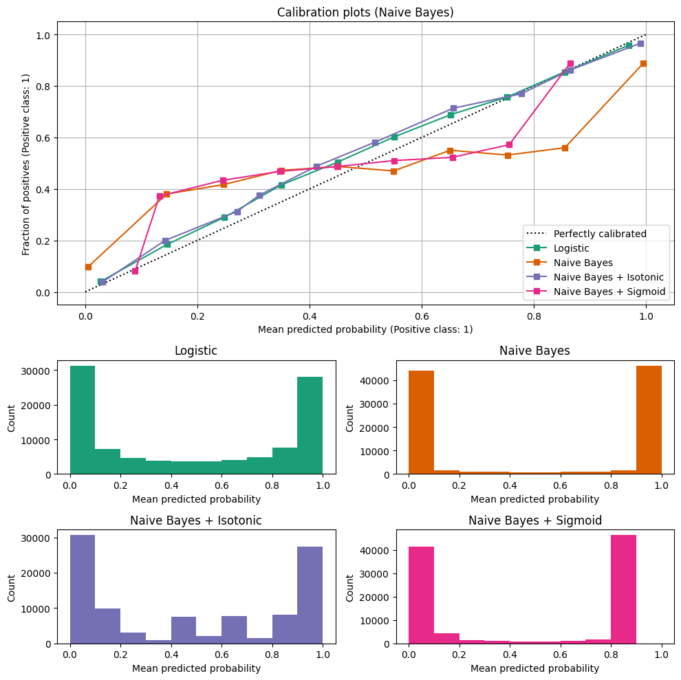
First, have a look at the diagonal line. It represents a perfectly calibrated classifier: The model’s output between 0 and 1 is precisely the probability that a sample belongs to the positive class. For example, if the model outputs 0.5, there’s a 50:50 chance the sample belongs to either the positive or negative class. If the model outputs 0.2 for a sample, there is only a 20% chance that the sample belongs to the positive class.
Next, consider the calibration curve for the Naive Bayes classifier: You see that even when this model outputs 0, there is about a 10% chance that the sample is positive. If the model outputs 0.8, there’s still a 50% chance that the sample belongs to the negative class. Hence, the classifier’s output does not reflect its confidence.
Computing the “fraction of positives” is far from straightforward. We need to create bins based on the model’s outputs, which is complicated by the fact that the distribution of samples across the model’s value range is typically not homogeneous. For example, a logistic regression classifier typically assigns values close to 0 or 1 to many samples but rarely outputs values close to 0.5. You can find a more in-depth discussion of this topic in the scikit-learn documentation. There, you can also dive into possible ways to re-calibrate models, which is beyond the scope of this article.
For our purposes here, we’ve seen how calibration curves visualize complex model behavior in an easy-to-grasp fashion. From a quick glance at the plot, we can see whether models are well-calibrated and which comes closest to the ideal.
Visualizing hyperparameter tuning
Hyperparameter tuning is a critical step in developing a machine-learning model. The aim is to select the best configuration of hyperparameters – a generic name for parameters not learned by the model from the data but pre-defined by its human creators. Visualizations can aid data scientists in understanding the impact of different hyperparameters on a model’s performance and properties.
Finding the optimal configuration of hyperparameters is a skill on its own and goes far beyond the machine learning visualization aspect we will focus on here. To learn more about hyperparameter tuning in all its depth, I recommend this article on improving ML model performance by a former Amazon AI researcher.
A common approach to systematic hyperparameter optimization is creating a list of possible parameter combinations and training a model for each. This is often referred to as “grid search.”
For instance, if you are training a Support Vector Machine (SVM), you might want to try out different values for the parameters C (the regularization parameter) and gamma (the kernel coefficient):
import numpy as np

C_range = np.logspace(-2, 10, 13)
gamma_range = np.logspace(-9, 3, 13)

param_grid = {“gamma”: gamma_range, “C”: C_range}
Using scikit-learn’s GridSearchCV, you can train models for each possible combination (using a cross-validation strategy) and find the best one with respect to an evaluation metric:
from sklearn.model_selection import GridSearchCV,

grid = GridSearchCV(SVC(), param_grid=param_grid, scoring=’accuracy’)
grid.fit(X, y)
After the grid search concludes, you can inspect the results:
print(
"The best parameters are %s with a score of %0.2f"
% (grid.best_params_, grid.best_score_)
)
But we’re usually not just interested in finding the best model but also want to understand the effect its parameters have. For example, if a parameter does not influence the model’s performance, we don’t need to waste time and money by trying out even more different values. On the other hand, if we see that as a parameter’s value increases, the model’s performance gets better, we might want to try even higher values for this parameter.
Here’s a visualization of the grid search we just performed:

From the plot, we see that the value of gamma greatly influences the SVM’s performance. If gamma is set too high, the influence radius of support vectors is minimal, potentially causing overfitting even with substantial regularization through C. Conversely, an extremely small gamma overly restricts the model, making it incapable of capturing the intricacies of the patterns within the data. In this scenario, the influence region of any support vector spans the entire training set, rendering the model akin to a linear one, using hyperplanes to separate dense areas of different classes.
The best models lie along a diagonal line of C and gamma, as depicted in the second plot panel. By adjusting gamma (lower values for smoother models) and increasing C (higher values for greater emphasis on correct classification), we can traverse this diagonal to achieve well-performing models.
Even from this simple example, you can see how helpful visualizations are for drilling down into the root causes of differences in model performance. This is why many machine-learning experiment tracking tools enable data scientists to create different types of visualizations to compare model versions.

How to Compare Multiple Runs
Feature importance visualization
Feature importance visualizations provide a clear and intuitive way to grasp the contribution of each feature in the model’s decision-making process. Understanding which features significantly influence predictions is paramount in many applications.
Plenty of different approaches to extracting insights about feature importance from machine-learning models exist. Broadly speaking, we can divide them into two categories:
- Some kinds of models, like decision trees and random forests, inherently contain feature importance information as part of their model structure. All we need to do is extract and visualize it.
- Most machine-learning models in use today do not provide feature importance information out of the box. We have to use statistical techniques and algorithmic approaches to uncover the importance of each of their input features on the model’s final output.
In the following, we’ll look at one example of each category: the mean decrease in impurity approach for random forest models and the model-agnostic LIME interpretability method. Other approaches you might want to look into comprise permutation importance, SHAP, and integrated gradients.
For the purpose of this article, we don’t care so much about how to obtain feature-importance data but about its visualization. To this end, bar charts are the top choice for structured data, with the length of each bar signifying the feature’s importance. Heatmaps are a clear favorite for images, and for text data, highlighting the most important words or phrases is typical.
In a business context, feature importance visualization is an invaluable tool for stakeholder communication. It provides a straightforward narrative, demonstrating the factors that predominantly influence predictions. This transparency enhances decision-making and can foster trust in the model’s outcomes.

Mean decrease in impurity
The mean decrease in impurity is a measure of each feature’s contribution to a decision tree’s performance. To understand this, we’ll first need to understand what “impurity” means in this context.
We’ll start with an analogy:
- Let’s say we have a fruit basket with apples, pears, and oranges. When the pieces of fruit are in the basket, they’re thoroughly mixed, and we could say this set has a high impurity.
- Now, our task is to sort them by kind. If we put all the apples into a bowl, place the oranges on a tray, and leave the pears in the basket, we would be left with three sets that have perfect purity.
- But here comes the twist: We cannot see the fruits while making our decision. For each piece of fruit, we are told its color, diameter, and weight. Then, we need to decide where it should go. Thus, these three properties are our features.
- The weight and the diameter of the pieces of fruit will be very similar. They won’t help us much in sorting – or, to say it differently, they are unhelpful in decreasing the impurity.
- But the color will be helpful. We might still struggle to distinguish between green or yellow apples and green or yellow pears, but if we learn that the color is red or orange, we can confidently make a decision. Thus, the “color” will give us the biggest mean decrease in impurity.
Now, let’s use this analogy in the context of decision trees and random forests:
When building a decision tree, we want each node to be as pure as possible regarding the target variable. In more colloquial terms, when creating a new node for our tree, we aim to find the feature that best splits the samples that reach the node into two distinct sets so that samples with the same label are in the same set. (For the full mathematical details, see the scikit-learn documentation).
Each node in a decision tree reduces the impurity – roughly speaking, it helps sort the training samples by their target label. Suppose a feature is the decision criterion in many nodes in the tree, and it’s effective in cleanly dividing the samples. In that case, it will be responsible for a large share of the reduction in impurity the decision tree achieves overall. That’s why looking at the “mean decrease in impurity” a feature is responsible for is a good measure of the importance of a feature.
Whew, that was a lot of complicated math and terminology!
Luckily, the visualizations are not quite that difficult to read. We can clearly identify our model’s primary drivers and use that information in feature selection. Reducing a model’s input space to just the most decisive features reduces its complexity and can prevent overfitting.
Additionally, understanding feature importance informs data preparation. Features with low importance might be candidates for removal or consolidation, streamlining the input data preprocessing.
There’s one important caveat, though, that I would like to mention before we move on. Since a node’s decrease in impurity is determined during training, using the training data set, the “mean decrease in impurity” doesn’t necessarily translate to previously unseen test data:
Consider the case that our training samples are numbered, and this number is an input feature for our model. Then, if our decision tree is complex enough, it can just learn which sample has which label (e.g., “fruit 1 is an orange”, “fruit 2 is an apple”, …). The mean decrease in impurity for the number feature will be massive, and it will appear as a highly important feature in our visualization, even though it’s entirely useless when applying our model to data it has not seen before.
Local interpretable model-agnostic explanations (LIME)
Local interpretability approaches aim to shed light on a model’s behavior in a specific instance. (The opposite is global interpretability, where a model’s behavior across its entire feature space is examined.)

One of the oldest and still widely used techniques is LIME (Local Interpretable Model-agnostic Explanations). To uncover the contributions of each input feature to the model’s prediction, a linear model is fitted that approximates the model’s behavior in the particular area of the feature space. Roughly speaking, the linear model’s coefficients reflect the importance of the input features. The result can be visualized as a feature importance plot, highlighting the most influential features for a particular prediction.
Local interpretability techniques can extract intuitive insights from complex algorithms. Visualization of these results can support discussions with business stakeholders or be the foundation for cross-checking a model’s learned behavior with domain experts. They provide practical, actionable insights, enhance trust in a model’s intricate inner workings, and can be a vital tool for promoting machine learning adoption.
How to Improve ML Model Performance [Best Practices From Ex-Amazon AI Researcher]
How to adopt model visualization in machine learning?
In this section, I’ll share tips on seamlessly integrating model visualization into your daily data science and machine learning routines.

1. Start with a clear purpose
Before diving into model visualization, establish a clear purpose. Ask yourself, “What specific goals do I aim to achieve through visualization?”
Are you seeking to …
- … improve model performance?
- … enhance interpretability?
- … better communicate results to stakeholders?
Defining your objectives will provide the direction needed for effective visualization.
2. Choosing the appropriate visualization
Always have a top-to-bottom approach. This means you start at a very abstract level and then explore deeper for more insights.
For instance, if you are seeking to improve the model’s performance, then make sure that you start with simple approaches first, like plotting the model’s accuracy and loss using simple line plots.
Let’s assume that your model is overfitting. Then, you can use feature importance techniques to rank features based on their contribution to model performance. You can plot these feature importance scores to visualize the most influential features in the model. Features with high importance might point to overfitting and information leakage.
Likewise, you can create partial dependence plots for relevant features. PDPs show how the target variable’s prediction changes as a specific feature varies while keeping other features constant. You must look for erratic behavior or sharp fluctuations in the curve, which could indicate overfitting due to that feature.
3. Select the right tools
Selecting the right tools depends on the task at hand and the features the tools offer. Python offers a plethora of libraries like Matplotlib, Seaborn, and Plotly for creating static and interactive visualizations. Framework-specific tools, such as TensorBoard for TensorFlow and scikit-plot for scikit-learn, can be invaluable for model-specific visualizations.

The Best Tools for Machine Learning Model Visualization
4. Iterate and improve
Remember that model visualization is an iterative process. Continuously refine your visualizations based on feedback from your team and the stakeholders you present them to. The ultimate goal is to make your models transparent, interpretable, and accessible to all stakeholders. Their input and evolving project requirements might mean you need to reconsider and adapt your approach.
Incorporating model visualization into your daily data science or machine learning practice empowers you to make data-driven decisions with clarity and confidence. Whether you’re a data scientist, a domain expert, or a decision-maker, adopting model visualization as a routine practice is a pivotal step in harnessing the full potential of your machine-learning projects.
Conclusion
Effective machine-learning model visualization is an indispensable tool for any data scientist. It empowers practitioners to gain insights, make informed decisions, and communicate results transparently.
In this article, we covered a lot of information about how we visualize machine learning models. To conclude, here are some key takeaways:
Purpose of visualization in machine learning:
- Visualizations simplify complex ML model structures and data patterns for better understanding.
- Interactive visualizations and Visual ML tools empower users to dynamically interact with data and models. They can tweak parameters, zoom in on details, and better understand the ML system.
- Visualizations foster informed decision-making and effective communication of results.
Types of machine learning visualizations:
- Model structure visualizations help data scientists, AI researchers, and business stakeholders understand complex algorithms and data flows.
- Model performance visualizations provide insight into the performance characteristics of individual models and model ensembles.
- Visualizations for comparative model analysis aid practitioners in selecting the best-performing model or verifying that a new model version is an improvement.
- Feature importance visualizations uncover each input feature’s influence on a model’s output.
Best practices for adopting model visualization:
- Start with defined objectives and simple visualizations.
- Choose an appropriate visualization method that suits your needs and is accessible to the intended audience.
- Select the proper tools and libraries that help you craft accurate visualizations efficiently.
- Continuously listen to feedback and adapt your visualizations to your stakeholders’ needs.
